eazyBI Features
Spend your time exploring and analyzing your data, not fighting it. No complex configurations or setup is required.
Custom Reports, Charts, and Dashboards
Create custom reports, charts, and dashboards with an easy-to-use drag-and-drop report builder. Create new tables, charts, reports, and dashboards with just a couple of clicks. Quickly discover new insights and opportunities with all your data at your fingertips.
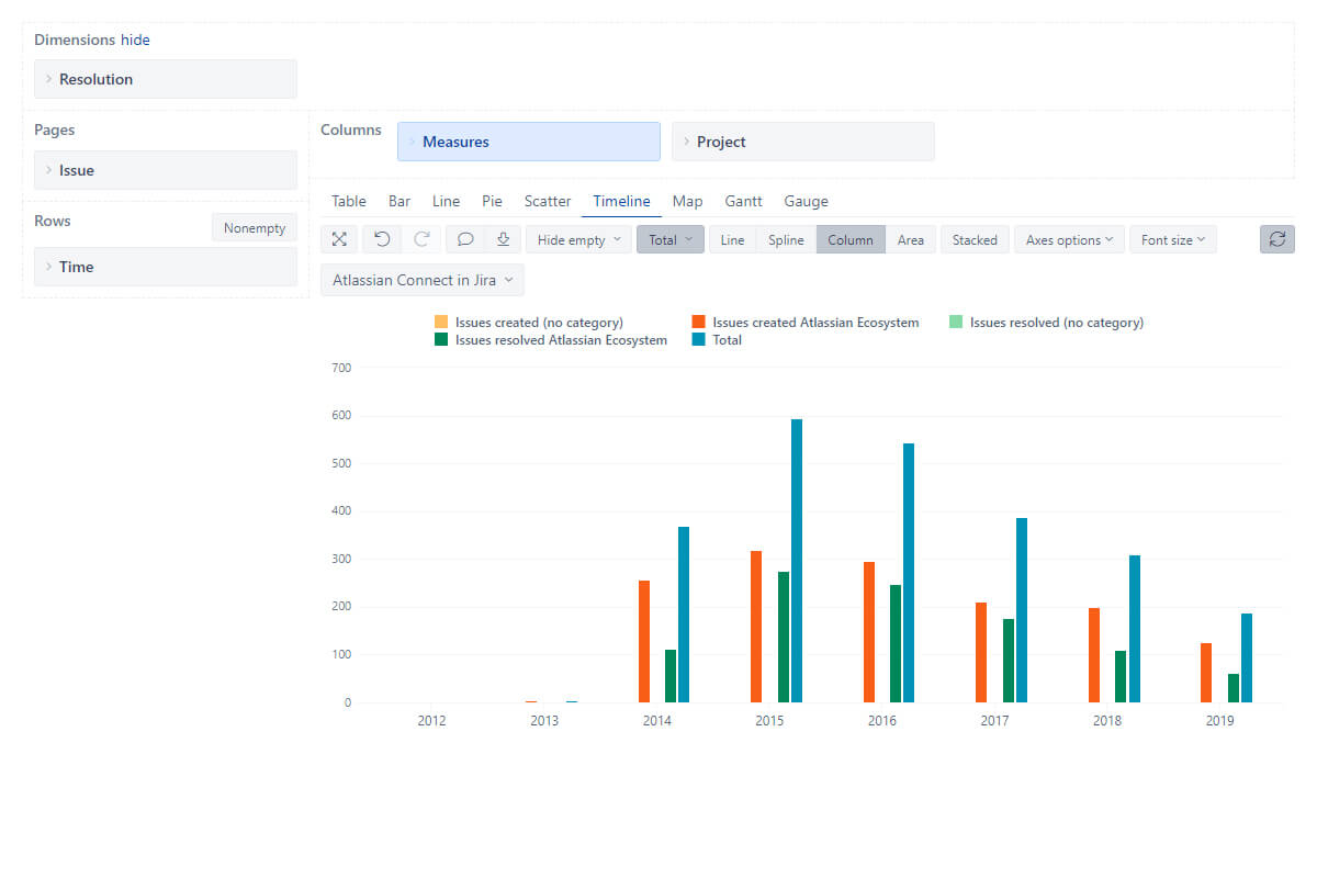
Interactive Data Analysis and Visualization
Explore and analyze your data with an instant feedback. Start with a summary and dig into details to examine your business data with multi-dimensional analysis. Drill-in or across other dimensions right from the report. Find actionable insights, trends, and opportunities, make smart and data-driven decisions.
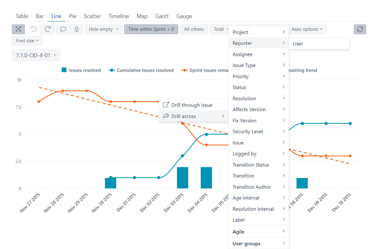
Powerful Calculations for Advanced Users
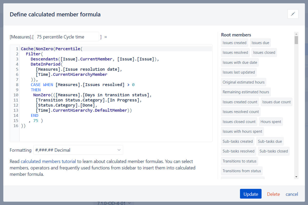
Go way beyond basic analysis by creating new measures and powerful calculations. Start with many predefined calculations or write your own using the built-in MDX editor with auto-complete and syntax highlighting. Perform multi-dimensional analysis and examine your business data in almost any way you need.
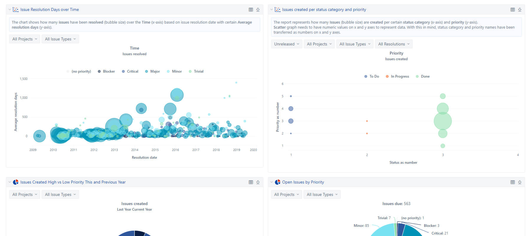
Personalized Reports and Dashboards
Create powerful, personalized reports and dashboards in minutes, and enjoy regular automatic data updates, with simple configurations and setup.
Embed your reports and dashboards to share or publish them. Share privately via OpenSocial gadget or export any results to CSV or Excel.
Many Interactive Chart Types
Quickly switch between table, column, bar, line, area, pie, scatter, bubble, timeline, map, Gantt, gauge, or mixed charts to pick an interactive chart type that suits your data best.
Table Chart
All your numbers side by side
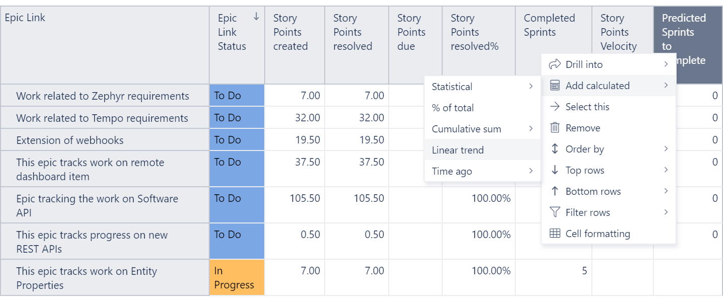
Drag and drop your columns, delve into details or across dimensions, set conditional formatting, create your filters or set limits.
Bar Chart
A classic way to represent your data comparing different data sets
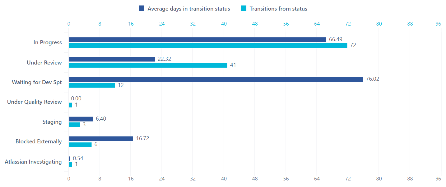
Switch between vertical or horizontal, stacked or un-stacked — all with a click.
Change colors, labels and separate axes to highlight the data you need. Create combo charts by combining different chart types.
Line Chart
The best way to illustrate trends over time
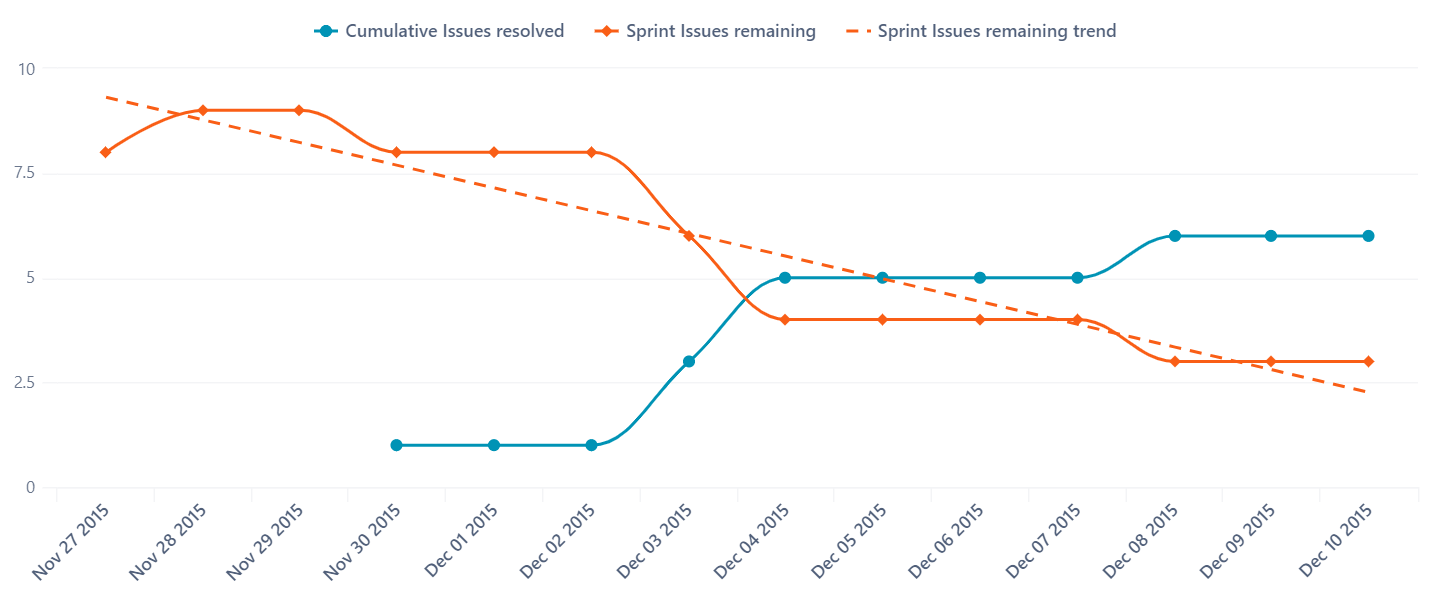
Compare several categories at once to see how they perform. Choose between line or area to highlight your data, or create a stacked area chart to display composition and a detailed trend.
Change colors, labels, and separate axes to make your comparisons more effective.
Pie Chart
Display a relative share from the total data-set
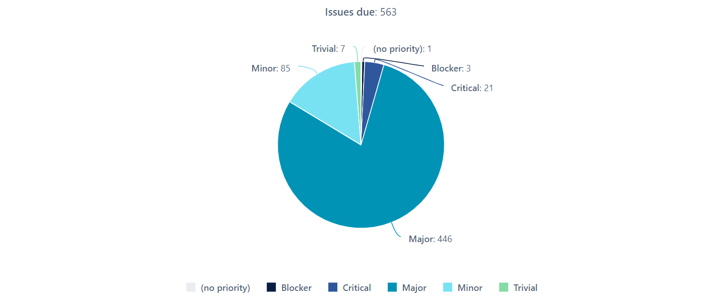
Illustrate a sample break down in a single dimension, or add more dimensions by creating a donut chart.
Scatter and Bubble Chart
Compare two or three parameters in a single chart
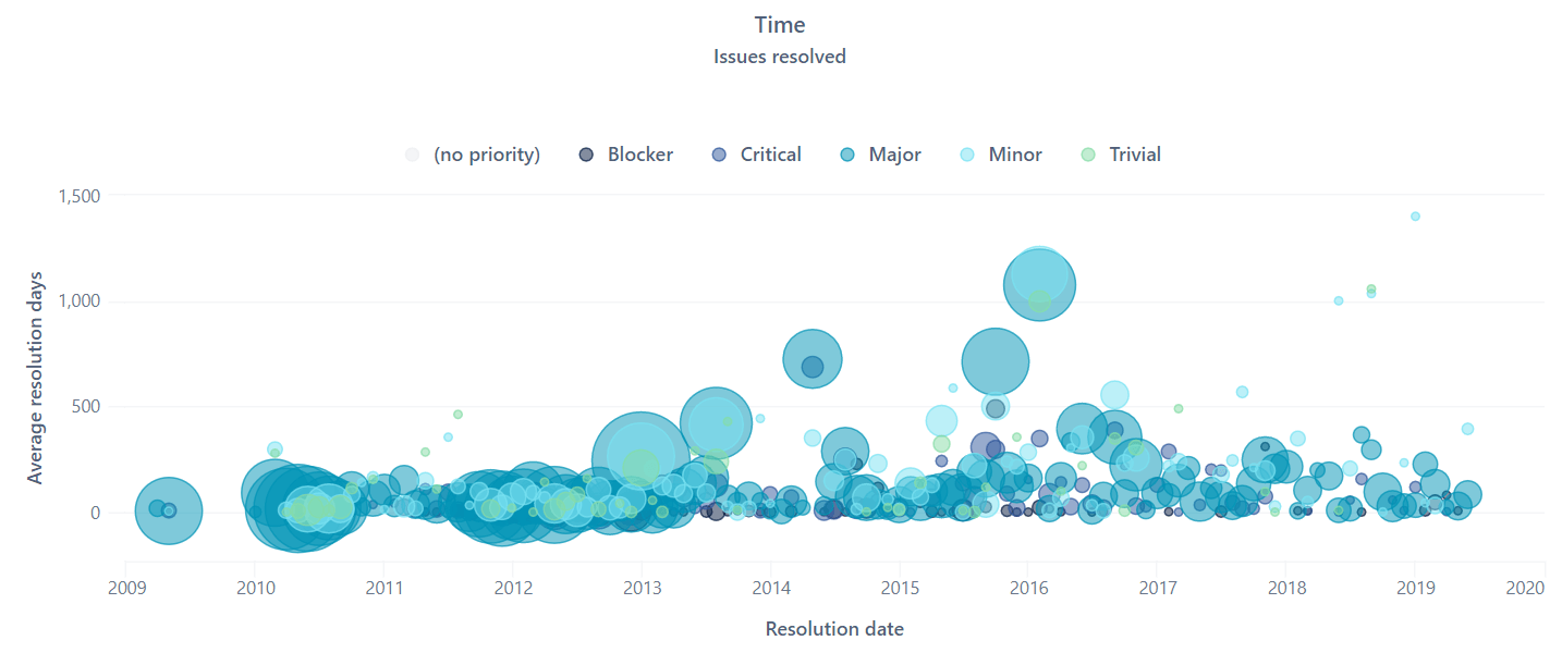
Clearly display the relationship between elements based on two variable parameters using a scatter chart, or add another dimension and create a bubble chart.
Quickly and easily drill into details or look across dimensions to see data distribution from different angles.
Special Timeline Chart
Illustrate and observe trends over time
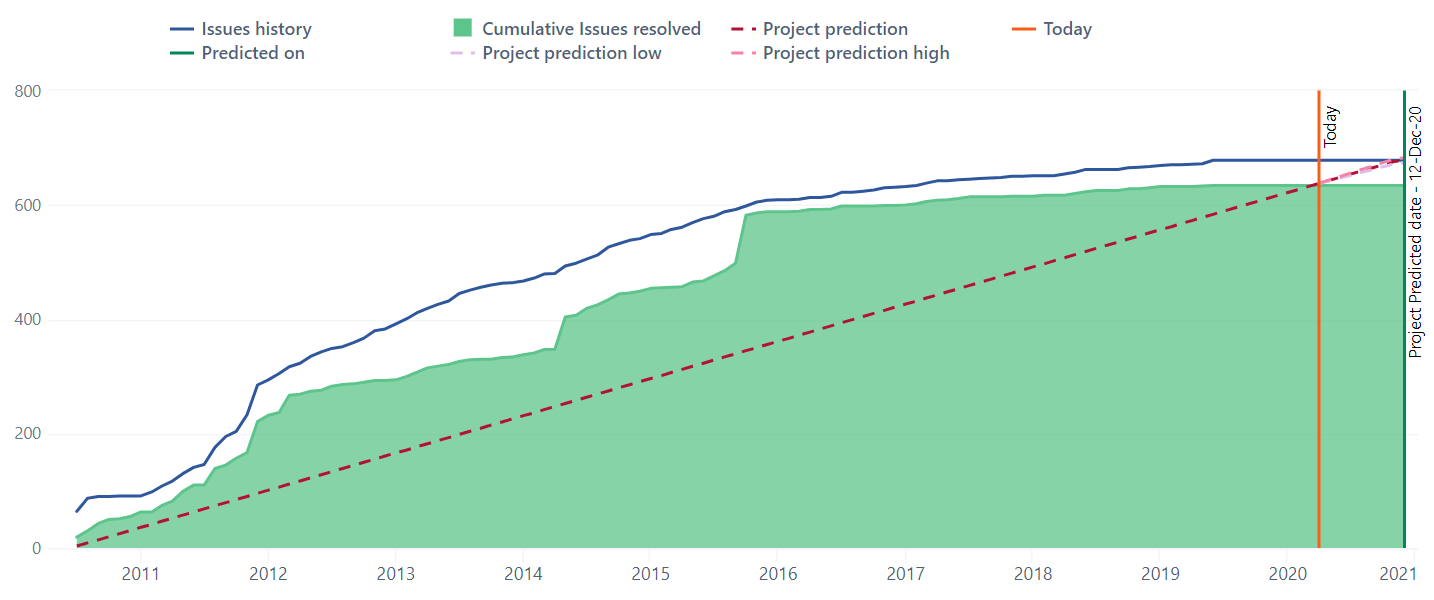
The Timeline Chart is a very special chart type that lets you zoom in and out with a simple click and drag, selecting an exact time frame.Set a specific time filter using common language, like “30 days ago.”
Select any data point and drill into more details with a click.
Choose between line, spline, column, or area chart types, and switch between stacked and un-stacked area or column charts to compare or evaluate.
Map Chart
Instantly see the insights based on geo-locations, such as country, region, and city
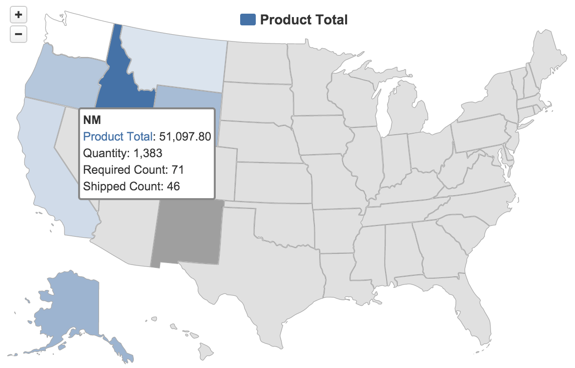
Switch between World map and Europe, or choose a specific county to see your regional distribution.
Hover your mouse over a certain area to see related information. Select between a static map or another map type, such as OpenStreetMap or MapQuest, to see a more visual geo-location-based distribution chart.
Gantt Chart
Quickly see the progress of your projects
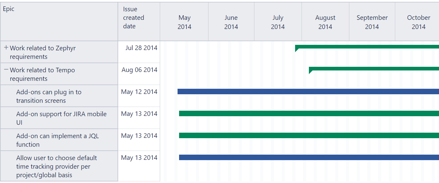
Switch from monthly to daily view to see up-to-date details and mouse-over any task to see all related information.
Set filters and quickly check individual projects, employees, tasks, and statuses to identify all open, overdue actions, and to see individual performance.
Gauge Chart
All your KPI’s in one place
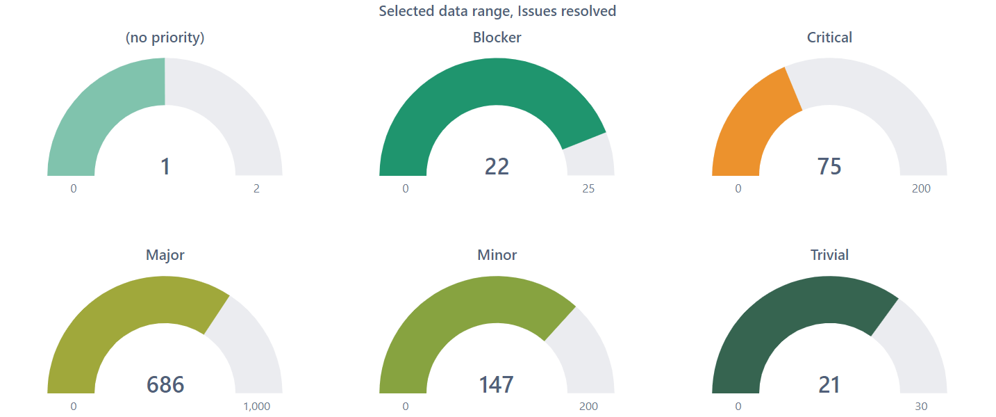
A Gauge Chart is a quick way to keep your finger on the pulse of your business.
Set your own Gauge limits or add powerful filters. Drill into details or across different categories.
Mixed Chart
When a simple chart just cannot tell the whole story
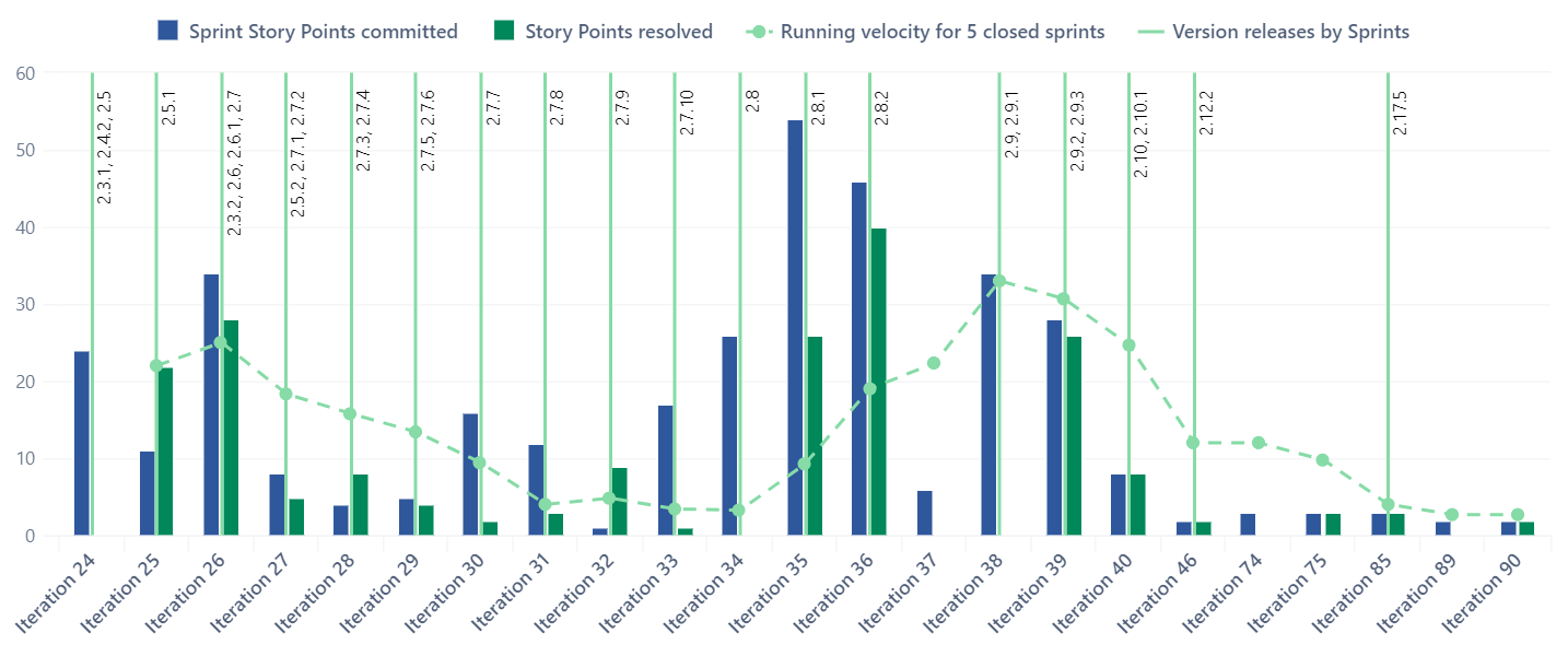
Create visually appealing and easily comprehensible charts by mixing and matching different chart types. Start with a basic bar chart and add different chart types to the mix Choose between different colors or point-symbols to highlight the key points.
Many Data Sources
Import your data from popular web applications, databases, or files.

Learn more

Learn more

Learn more

Learn more

Learn more

Learn more

Learn more

Learn more

Learn more

Learn more

Learn more

Learn more

Learn more

Learn more

Learn more

Learn more

Learn more

Learn more

Learn more

Learn more

Learn more

Learn more

Learn more

Learn more

Learn more

Learn more

Learn more

Learn more

Learn more

Learn more
Start a 30-day Free Trial
Try eazyBI free for 30 days to see if it's right for you. If you need any help or support, feel free to reach out to support@eazybi.com—we're there for you.
eazyBI Products

eazyBI for Jira
Learn more
eazyBI for Confluence
Learn more
Private eazyBI
Learn more
eazyBI Cloud
Learn moreEnjoy all these great features and functionality in all eazyBI products!
Questions, Feedback, Support, and Documentation
Please feel free to contact eazyBI support if you have any questions, feedback, or suggestions. We are always happy to hear from our clients.
For more detailed information about the main eazyBI concepts, data import, and the creation of charts, reports, and dashboards, please refer to eazyBI documentation.
