
How to Create Custom Tempo reports in Jira with eazyBI?
eazyBI has had integrations with Tempo for a very long time. But since eazyBI version 6.1 you can now easily access data also from Tempo Planner on all platforms–Cloud, Server, and Data Center. How to keep track of your planned and logged Tempo hours more efficiently?
![]() Tempo Planner is the most effective and dynamic resource planning and capacity reporting tool embedded in Jira, and allows planning for multiple resources on one issue.
Tempo Planner is the most effective and dynamic resource planning and capacity reporting tool embedded in Jira, and allows planning for multiple resources on one issue.
It is an indispensable tool for planning, tracking, and managing how your team is spending their time. Yet, even with the most thorough planning life always makes its own corrections. How to prevent the unexpected and the unpredictable?
In this article we’ll look at different ways you can monitor your project progress with custom Tempo Planner reports to make sure your projects are on time and on budget.
If you prefer a more in-depth video, feel free to watch the Tempo and eazyBI webinar covering the integration between eazyBI and Tempo Planner as well as several useful use-cases.
In Search for Meaning
Insights are often hidden in plain sight. The same object looks different when you look at it from a different perspective. The same is true for data.
The good news is that you already have the data–Jira issues, Tempo Planner’s planned and spent hours, teams, assignments, and projects. Use it to monitor your project performance, bottlenecks, outliers, trends, anomalies, and more. Make well-informed, timely, smart decisions and prevent disasters before they emerge.
Tempo Planner has a set of useful built-in reports providing operative insights of your planned and spent hours. But you can go even further with eazyBI Reports and Charts for Jira.
Introducing eazyBI
eazyBI is more than just a set of reports and charts. It’s a fully-featured business intelligence app (and hence the BI). With eazyBI you can explore, analyze, and visualize your data from every possible perspective. Jira Software, Jira Service Desk, Tempo and other popular apps, as well as external data sources–you can access them all.
Now you can easily access, analyze, and visualize your Tempo Planner data in eazyBI on all platforms–Cloud, Server, and Data Center.
- Manage your time smarter, identify bottlenecks and main underlying causes.
- Reduce estimation errors or ineffective resource allocation.
- Balance planned hours among teams and projects efficiently.
- Keep track of trends, threats, and opportunities.
- Monitor your performance and progress daily.
- Improve planning, execution, and forecasting.
- Keep your teams informed, productive, accountable, and responsible.
Let’s explore the Universe of Tempo Planner data and dive into several use cases.
Before we begin, you should know that you can copy these reports to your own eazyBI account using report definitions. Report definitions are like templates, describing report structure. Copy these report definitions from Tempo Planner report examples page in eazyBI documentation.
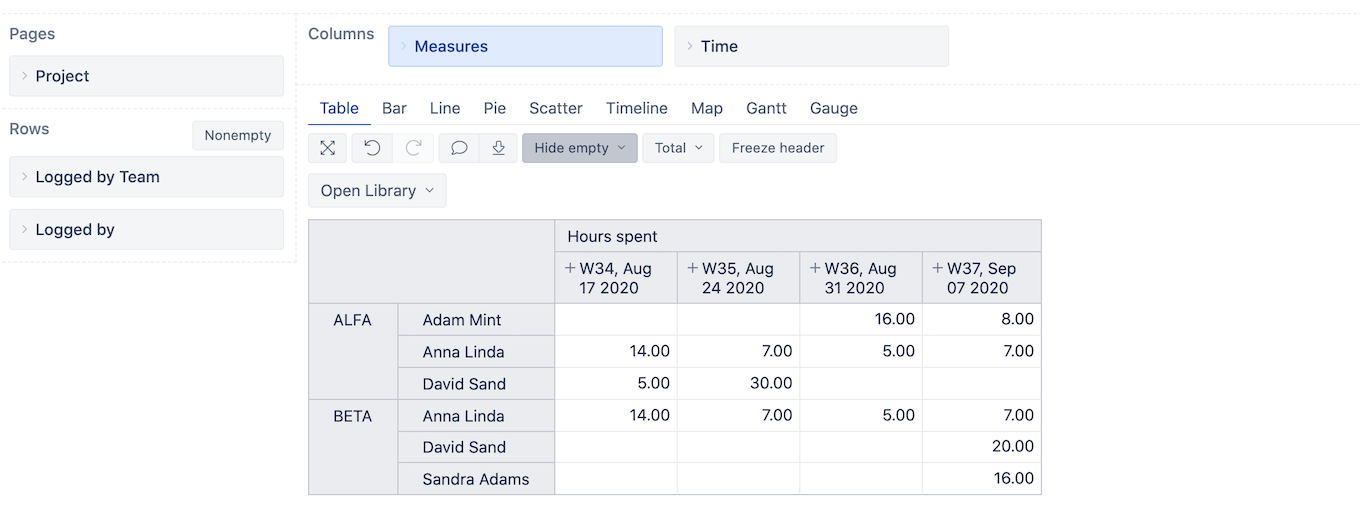
Team Hours Weekly Accountability Report
Analyze your hours spent by the team and by assignee over a period of time. See how much time was logged by each of the teams or in total. See at a glance who’s working on what and when. Balance your teams and employees to complete your projects in time and within budget.
Furthermore, use page filters to narrow down to specific time period, user, project, or any other issue dimension or combination–all from a single report.
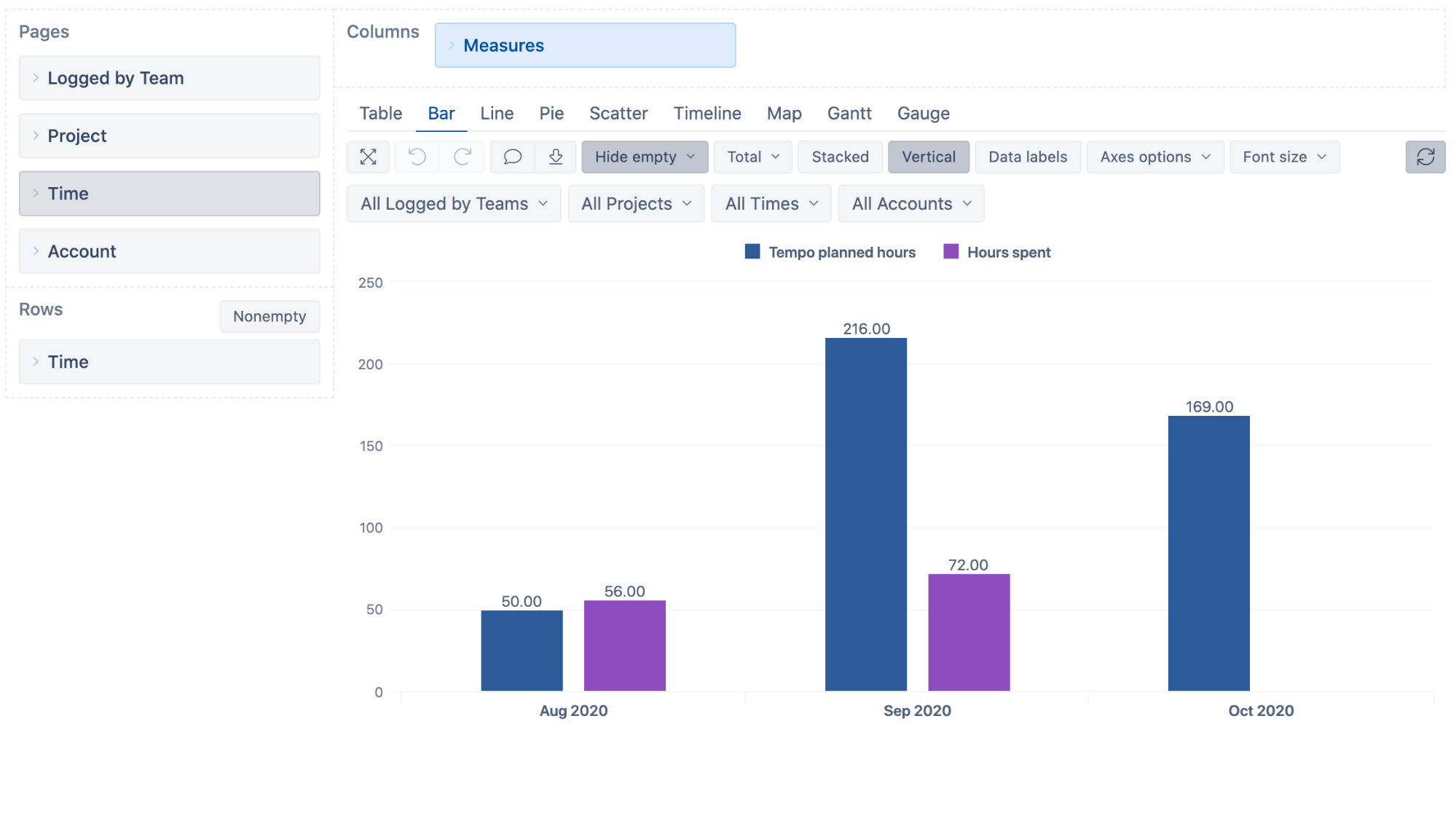
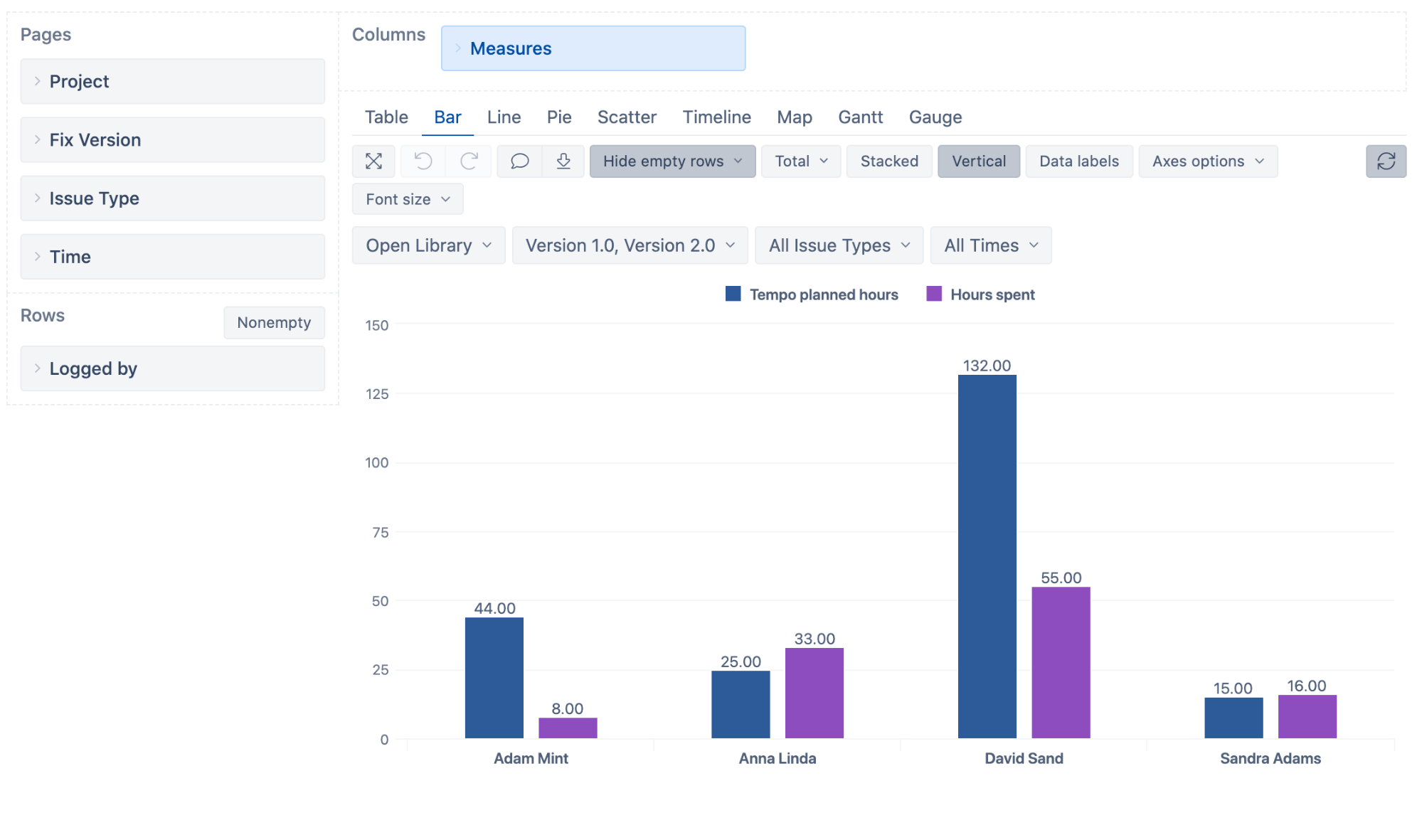
Tempo Hours Planned vs Hours Spent
Bar charts are good for comparing two or more sets of values. In eazyBI you can easily compare your Tempo hours planned vs hours spent over time side-by-side in a simple bar chart report.
But the true power here comes from using one or more dimensions in page filters. Now you can evaluate how your plans are holding up against actual logged hours for each team, project or account.
Reallocate some time for neglected projects to keep up with your milestones, or dig into project details to discover more.
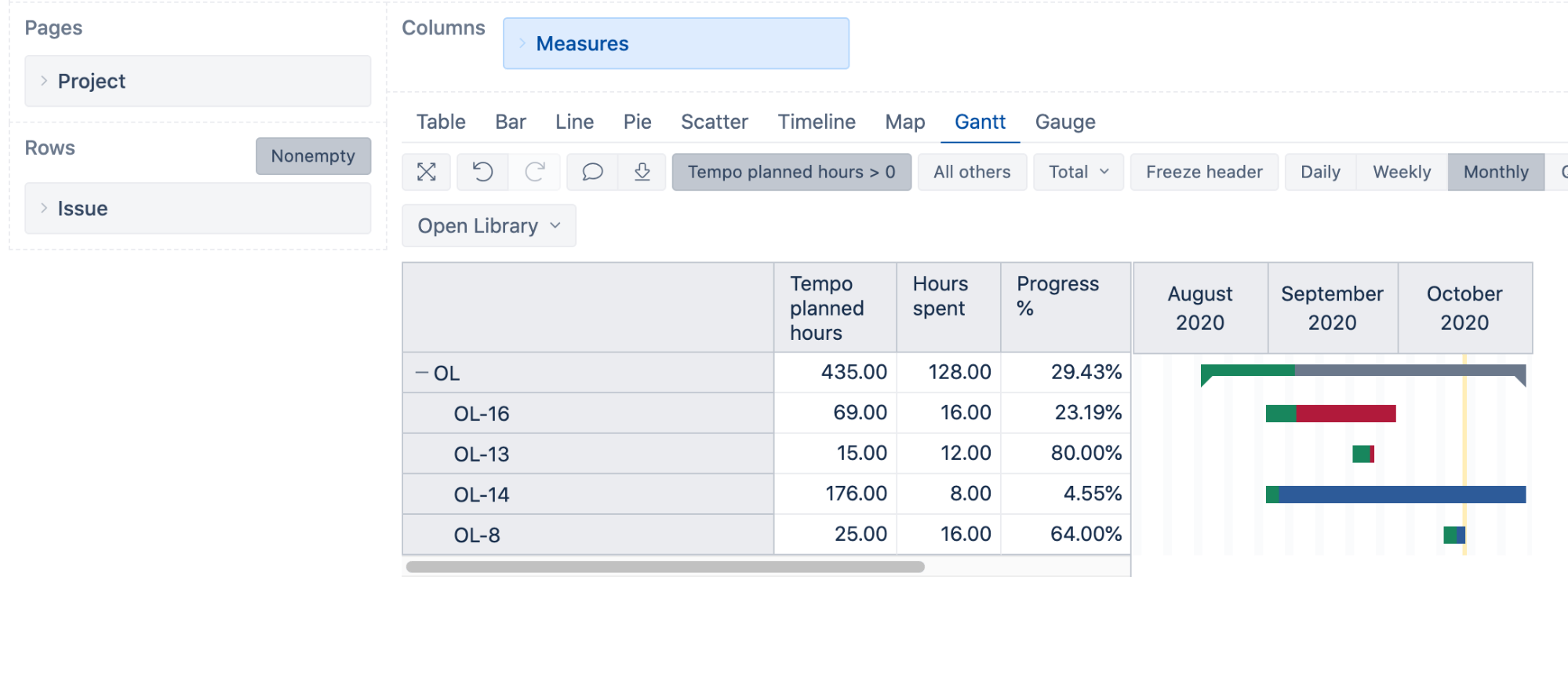
Gantt Chart for Project Planning & Progress
Each project has its own internal complexity. Sub-projects, dependencies, estimates, assignments, plans, and work actual progress. Use Gantt charts to help you make sense of all the moving parts without missing anything.
Start with project overview and general progress, and expand into sub-projects to see the status and progress of each component.
For a better overview, zoom in or out in the time-frame by selecting daily, weekly, monthly, quarterly, or yearly periods.
Planned Assigned Hours vs Contribution
The assignment vs contribution report will show you individual time spent vs total hours planned for each user.
Just like in other eazyBI reports, you can easily narrow it down by time period, project, version, or issue type.
You’ll notice that this report is very similar the previous “Planned vs Spent Hours” bar chart report. If you swap the “Logged by” dimension in the above report with the “Time” dimension, you’ll have the “Monthly Planned vs Spent Hours” report again. Swap it with the Project dimension in Rows and you’ll have your planned and spent hours broken down by project.
You have the full flexibility. You can break down your reports by Issue Type, Fix Version, or other issue dimension. There’s a lot to discover.
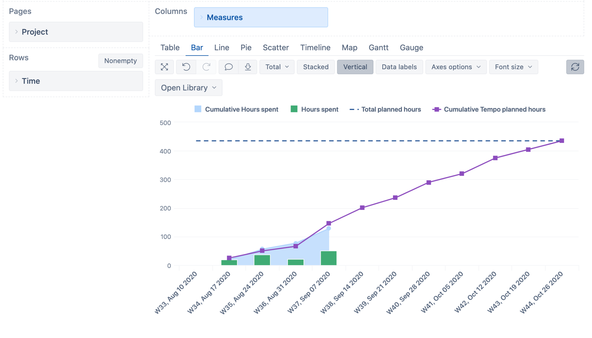
Project Flow Burn-Up Chart
Burn-up charts are good for project forecasting, planning, and overview. You can use the cumulative Tempo planned hours as a guideline and project road-map. Add weekly hours spent and cumulative hours spent to see how you stack up against the plan. Are you on track or have you over or underestimated?
Weekly Hours Spent by Issue Type
Where has your team spent the most time-hunting down bugs, or making new features? What does this information tell you about your processes? Should you account for some additional time during the project, to address all the bugs.
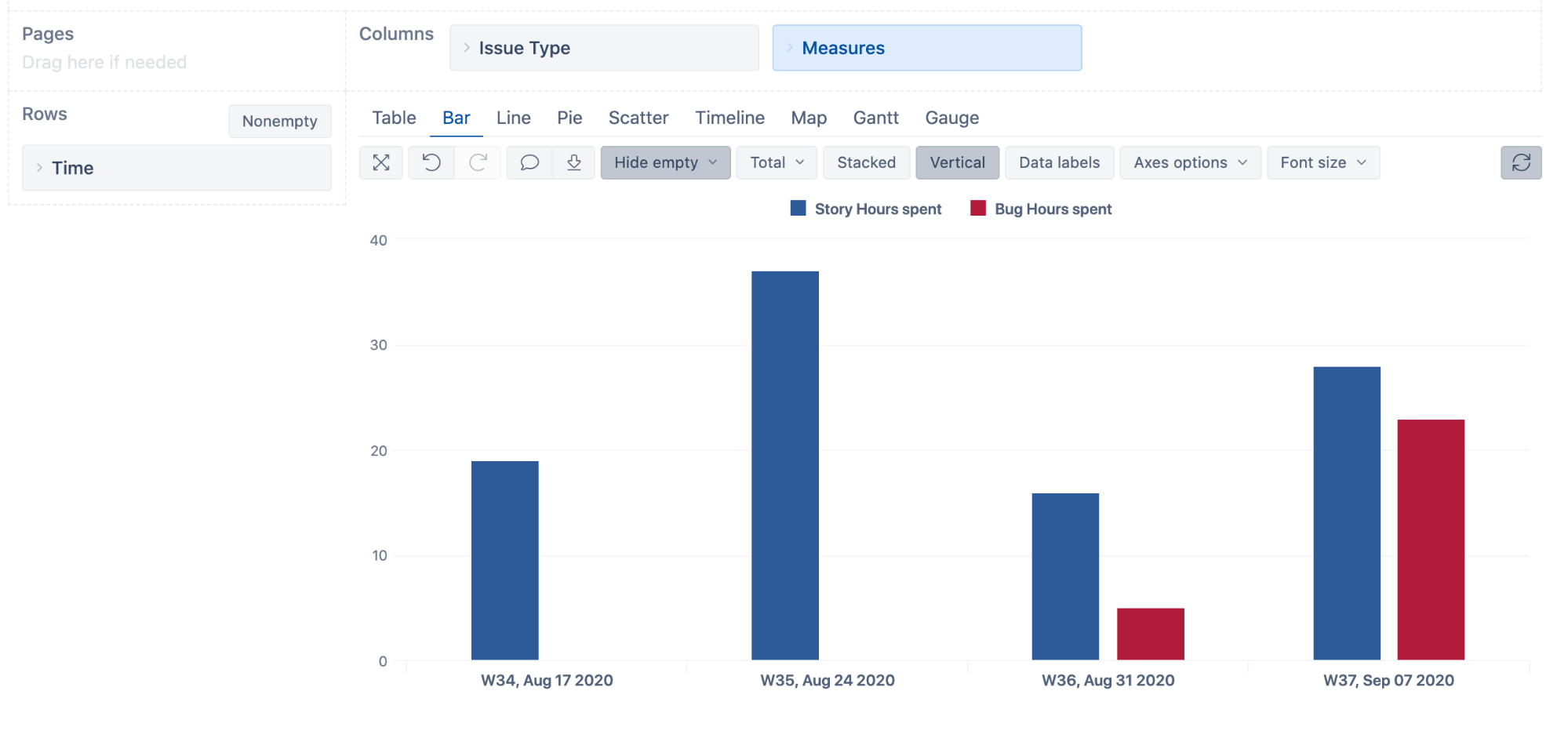
Add another layer to this project by breaking it down by assignee to see who’s working on stories and who’s fixing bugs.
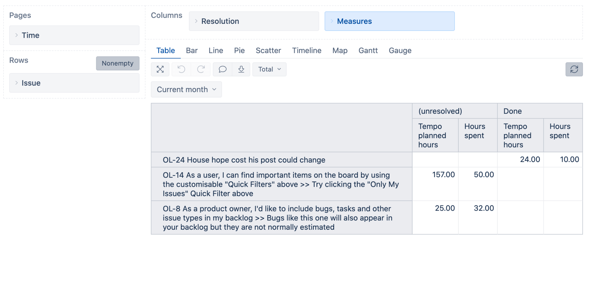
Planned vs Spent Hours by Issue Resolution
One of the best ways to identify under-estimated or overestimated hours is to see your Tempo planned and spent hours by for resolved issues.
In the example below you can see that the first issue is “Done” needed only 10 hours instead of 24 hours planned. Now you can reallocate additional hours to other tasks or update your project estimates accordingly.
Experiment, Explore, Discover
This article covered only a few of the use-cases for project planning and analysis.
You can use the drag-and-drop simplicity and the flexibility of eazyBI to explore your data and look at your teams and projects from many different angles. Play around, experiment, explore, and discover. Build the right mix of reports to answer all your burning questions.
Share your insights with your team to provide feedback, motivation, accountability, and responsibility across all your projects.
Try eazyBI Reports and Charts for Jira free on Atlassian Marketplace and start your journey of Tempo data analysis.