
Learning eazyBI Step by Step
Building Jira reports in eazyBI is much easier when you know what to do first and what to leave for later. The eazyBI Learning Center gives you that path with short lessons, practical tasks, and a Jira sample dataset you can safely experiment with.
You won’t start with theory. You’ll start by doing: drag a dimension into the report, add measures, filter the view, change the chart type, and immediately see what changes. Across the first three courses, you’ll complete 20 guided lessons – from creating your very first report to more advanced chart and table formatting.
To make practice smooth, every user gets a training account with Jira sample data. It’s a sandbox where you can explore eazyBI features, test ideas, and save reports without affecting your production environment.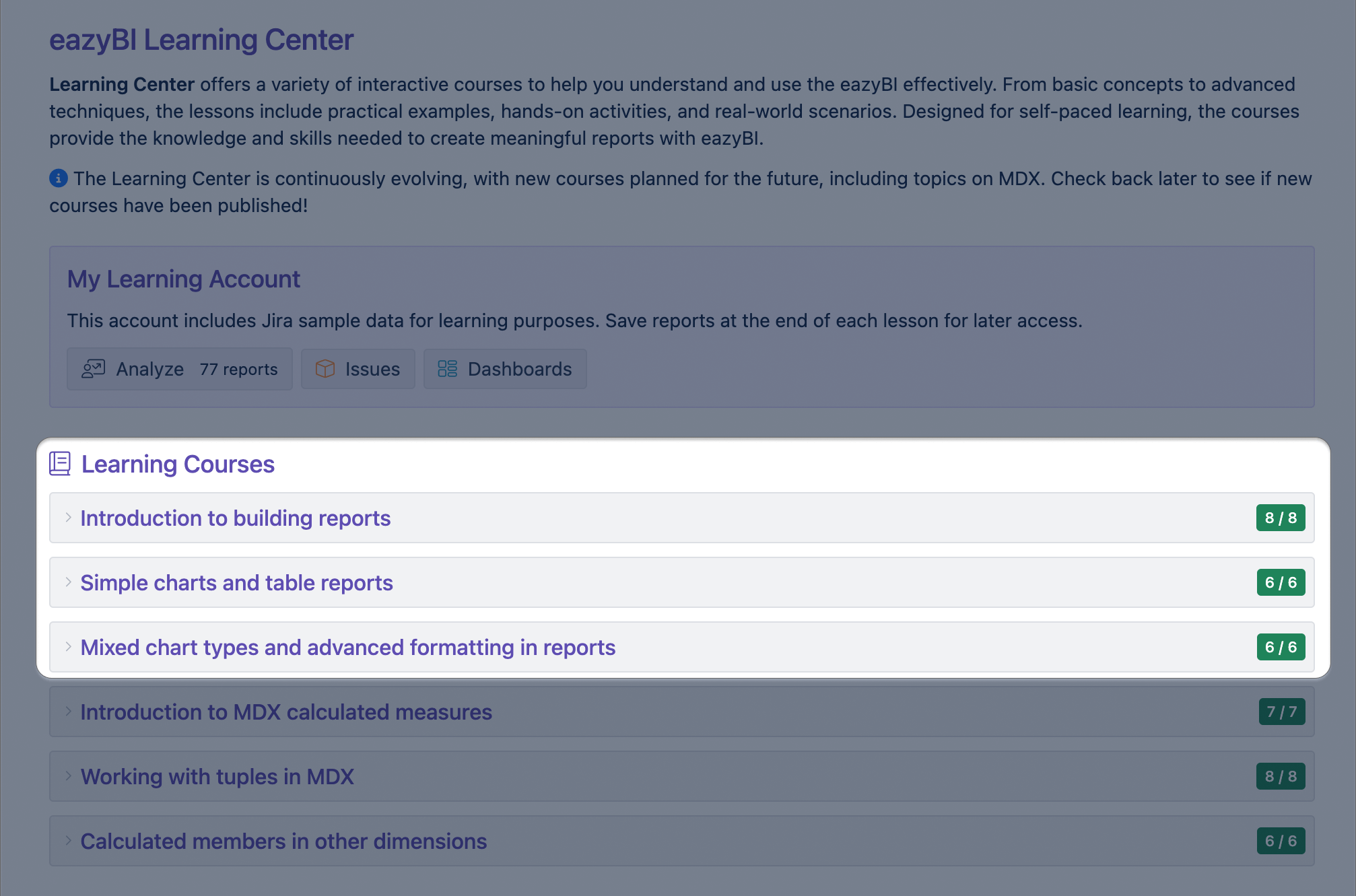
Course: Introduction to Building Reports
The first course introduces the fundamentals of building reports in eazyBI using Jira data. You’ll get comfortable with the report builder interface and learn what measures, dimensions, and properties mean in Jira terms. Also, you’ll explore data through drag and drop, drill into details, and use page and row filters to look at the same information from different angles.
Course: Simple Charts and Table Reports
Once you’re confident with the basics, the second course focuses on reports you may actually use day to day. You’ll build a project overview and progress reports, get the most active days, analyze versions, and learn how to combine dimensions and measures to answer common Jira questions.
One of the lessons is the Fix version progress report. Here, you will build a visual overview of unreleased versions, showing the total scope alongside resolved and unresolved work. By combining bars and scatter points in a single chart, the report makes it easy to see how much work has been done, how much remains open, and how each version is progressing at a glance.
As part of the lesson, you also refine the visual details — adjusting colors, adding percentage labels, and turning raw data into a clear, readable progress view.

Course: Mixed Chart Types and Advanced Formatting in Reports
The third course takes your reporting further with advanced formatting and chart combinations. You’ll work with mixed chart types, timelines, and separate axes to compare different metrics based on Jira data (such as issues resolved and hours spent) in a single view. You’ll also deepen your skills in conditional formatting for both tables and charts to make the most important values and patterns in the report stand out.
In the Performance report, part 2/2 lesson, you will bring these ideas together by creating a timeline that combines issue resolution trends with time tracking data. The chart shows how effort and delivery evolve over time, using columns, areas, and trend lines on separate axes to keep each metric easy to read.
This lesson helps you understand how to design richer reports that tell a story — not just by adding more data, but by choosing the right chart types, calculations, and formatting to make patterns and relationships stand out.

Learning Path That Grows With You
These three courses build on each other, but they’re flexible — you can follow the full sequence or jump into the topic you need most. The progression is intentional: no MDX, no shortcuts. You start by mastering the drag-and-drop report builder and core reporting concepts first, so you have a solid foundation for everything that comes next.
And when you’re ready to go further, the eazyBI Learning Center grows with you. You can continue into the introductory MDX courses to learn how to build calculated measures and expand what your reports can do — all with the same guided, practical approach that helps you learn with confidence.
Learn how to start using the eazyBI Learning Center in our documentation.