

eazyBI Has Now Become Easier
We have some great news to share with you. For the past couple of months, we have been silently working on some visual and functional improvements.
Take a look at the changes we've made so far.
Over the years, we have been actively listening to the feedback from our customers. Your questions, comments, and suggestions have been invaluable.
So far, our main priority has always been the core functionality of eazyBI. For a while, the user interface and usability questions have been neglected; not anymore.
In this release, our focus has been directed toward the “Account Analyze” page.
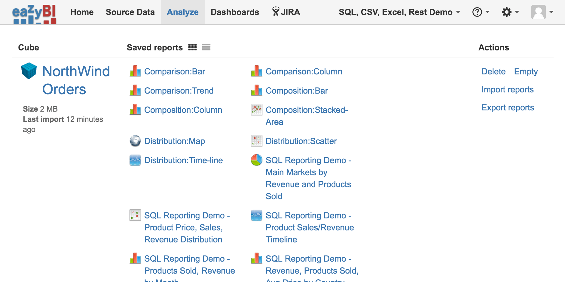
The Account Analyze page is one of the most visited pages on eazyBI. It makes perfect sense. This page is the starting point for most users. It is where all your cubes and reports are listed. Here's how it looked before:
What Have We Changed and Why?
The old Analyze page had quite a few usability issues. We used all your feedback to make this page cleaner, more friendly, and more intuitive.
The new interface is available on all platforms–eazyBI for Jira Cloud, eazyBI for Jira Server, and eazyBI for Jira Data Center, as well as standalone eazyBI Cloud and Private eazyBI versions.
More Space, More Clarity, More Control
The first thing you will most likely notice is the new layout. We wanted to make it easier for you to create and find your reports. The new “Analysis” page layout is more compact and clear. This applies to both the grid view and the list view.
We have moved the “Cube Action” links away from the right side of the cube. The name and action buttons are now on top of each cube block, right where the users normally look for them.
You can now hide or show all reports by collapsing or expanding your cubes. This will give you more control and help you find a particular report much quicker.
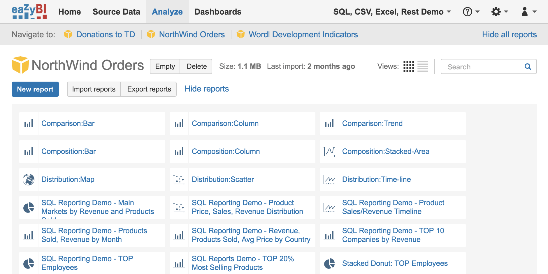
Now there is more room for your cubes and reports, giving you a better overview of your account.
A Consistent Look and Feel
You will also notice that we have changed the icons and colors. We are gradually transitioning to a unified color palette and icon style. This will make the experience of using eazyBI more consistent and pleasant.
The new icons and action buttons are now simpler, clearer, and more descriptive. Every icon visually identifies the type of each report. Most important action buttons, like “Save” or “New Report” now clearly stand out.
![]()
Find Your Reports Quicker
With a growing list of new reports, it becomes more difficult to find a particular report. Now you can search for a particular report by name. The new report search field will filter reports as you type.
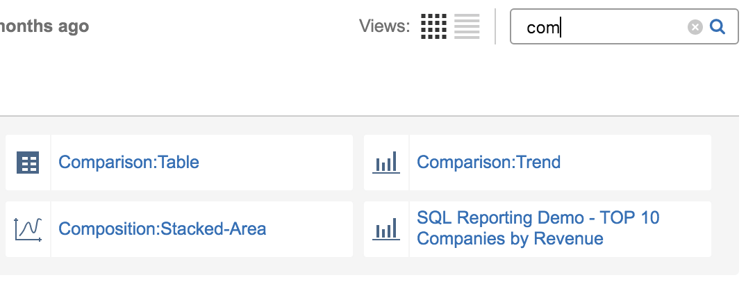
If you have more than one cube in your account, you will love the sticky cube navigation bar . Now you can go to any cube with one click.

Quick and Convenient Access to Most Important Actions
Creating a new _blank report is now more intuitive. In the previous interface, you had to click on the cube name. Many users found it confusing. Now there is a “New Report” button for it.

You can now rename, delete, or export your reports right from the Analyze page. You don’t need to open each report to access these options anymore.

We have made some minor changes to the reports view as well.
There is now a sticky navigation and action bar at the top. All the most common actions are now always accessible from the top right corner. But the breadcrumb navigation bar will always show the exact cube and report you are viewing.

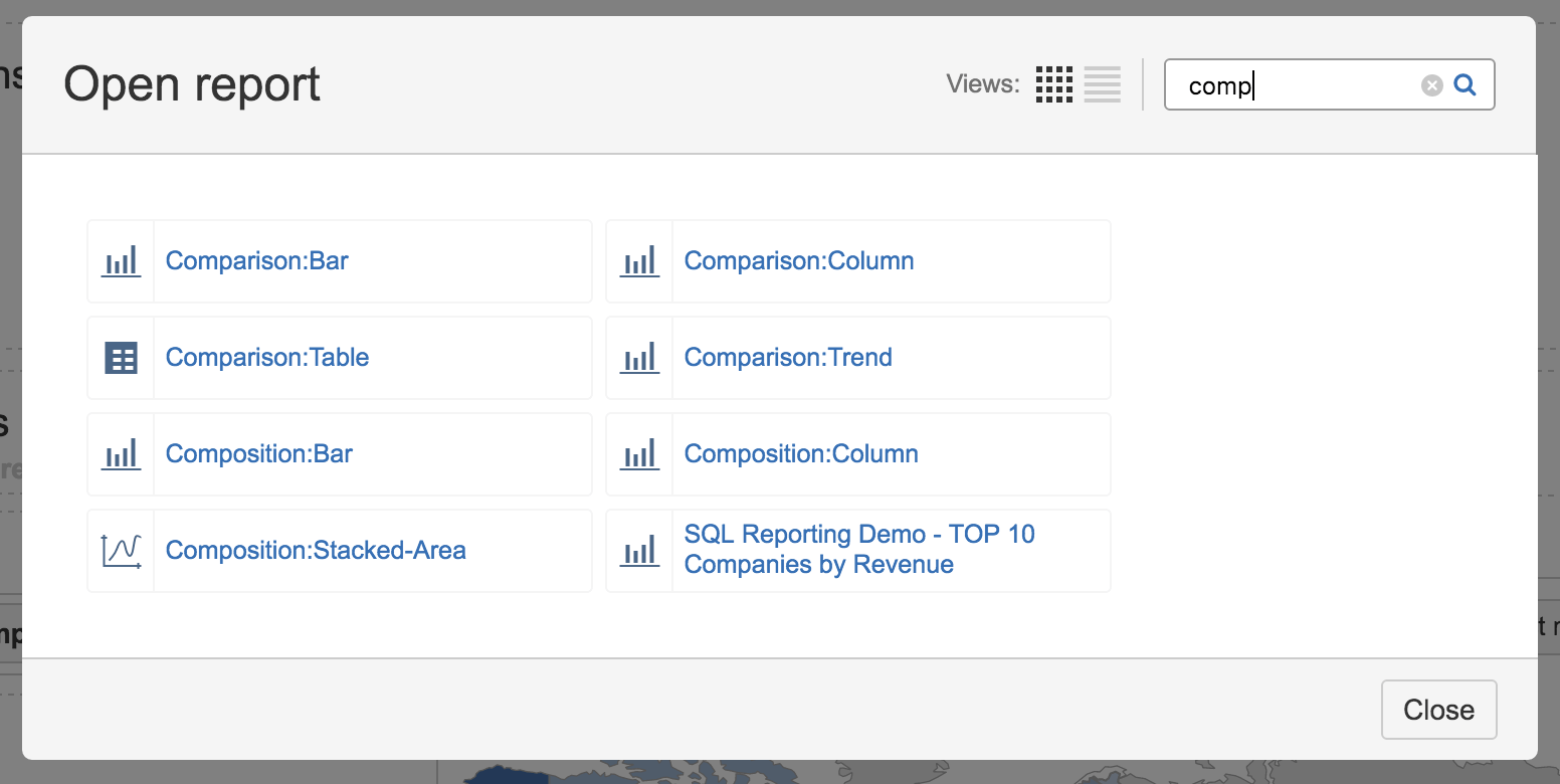
It is now more convenient to open reports from a “Report” page, or add reports to a dashboard from a “Dashboard” page. The new “Open Report” dialog is as clean and compact as the Analyze page, and it contains a search box, filtering reports as you type.
I hope you are as excited about these improvements as we are. Our developers are working on other improvements as I write this, so keep an eye out for further announcements.
Please keep your comments and suggestions coming.


