
eazyBI 6.0 Release Notes
Humans are hard-wired to do most things automatically. We wanted to satisfy this core desire making the process of report creation as intuitive as possible. The new interface was rebuilt almost completely from scratch. We are proud to present it to you this spring.
Could You Please Make the Charts Look Fancier?
Was it you who asked us this question? Or did we ask that question ourselves? One or another, here we are — launching the eazyBI version 6.0 with the new user interface (UI).
I hope that you are as excited as we are about the new look of the good-old eazyBI. Something that seems so self-explanatory (not to call it ”easy“) from your point of view, can take months or even years to get it right. Make no mistake, while the new interface may feel very similar and familiar, it was rebuilt almost completely from scratch. We are proud to present it to you this spring.
Don’t Make Me Think About UI
As a front-end developer, I’ve put a lot of effort into this UI update. I also talked about it in a presentation that I titled “Don’t Make Me Think About UI”. It’s a philosophy I firmly believe in. As humans, we are hard-wired to do most of the things automatically. We wanted to satisfy this core desire to make the process of report creation as intuitive as possible. You can watch the full recording from eazyBI Remote Community Day 2020 below.
How Do We Decide What Changes to Implement?
For us, just like many other companies out there, the customer is the boss. We know our product inside-out. We know what it can and cannot do. But it does not matter where we want to take it. What matters is where you want us to go.
While working on our new UI, we listened to all your comments and feedback you shared with us over time. We’ve been doing it since eazyBI was created. All the changes we make to our app are driven by you. Your role is to identify the area for the improvement and communicate it, and we take it further to decide on needed actions.
Your life does not get better by chance, it gets better by change
~ Jim Rohn
It Was Too Easy to Delete Your Reports
Back in times of eazyBI version 3.4, we received a lot of support tickets like - “I accidentally deleted all my reports” or “I wanted to empty the cube but deleted it instead”. While we did not experience this ourselves, we did not want our users to have that unpleasant experience.
The reason was simple. The “Delete” and “Empty” buttons were right next to each other.
To prevent you from deleting your cube by accident we decided to make it harder for you. We placed the “Delete” option in a drop-down menu and even painted it red. It worked! Now it is harder to make an unintended deletion accidentally.

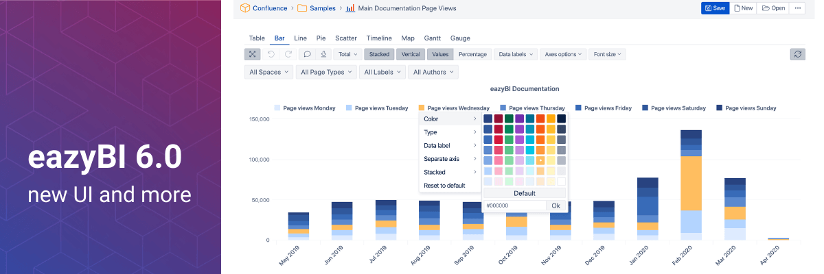
Fresh New Colors
Our previous color-picker allowed you to choose an unlimited amount of colors and tones. It was only an illusion of a choice. It made it hard to find a good combination of the colors and it also did not help to drive the consistency across different reports. The new color-picker provides a much broader set of default colors and tones for you to choose from.
This might seem like a simple improvement. However, we do not care only about the new reports, but also the existing ones. We did our best to replace old standard colors of existing charts with matching colors from the new color palette to make the transition for you as smooth as possible. This is how we improve with backward compatibility in mind.
We hope your charts will look fancier by default now.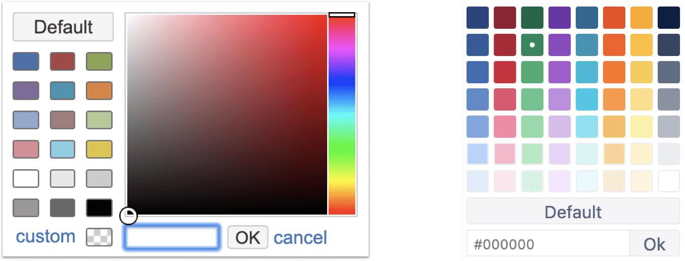
While color picker is a significant part of our new release, the entire app has changed its look to lighter tables and lines. It’s not possible to describe it in words, so let me show you instead.
New UI and Colors in Action
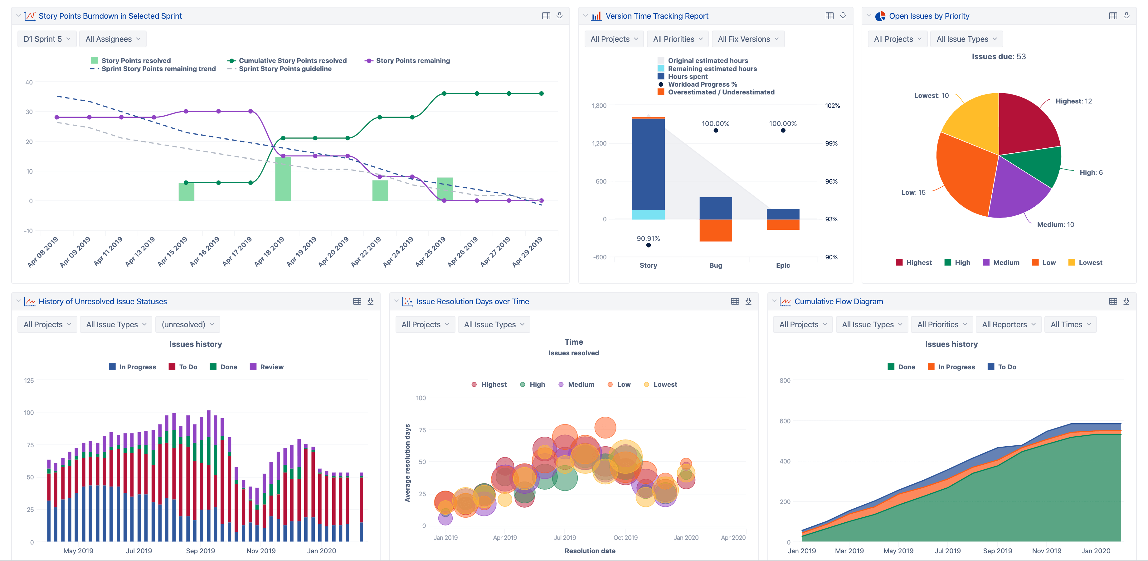 More appealing Jira Reports and Dashboards
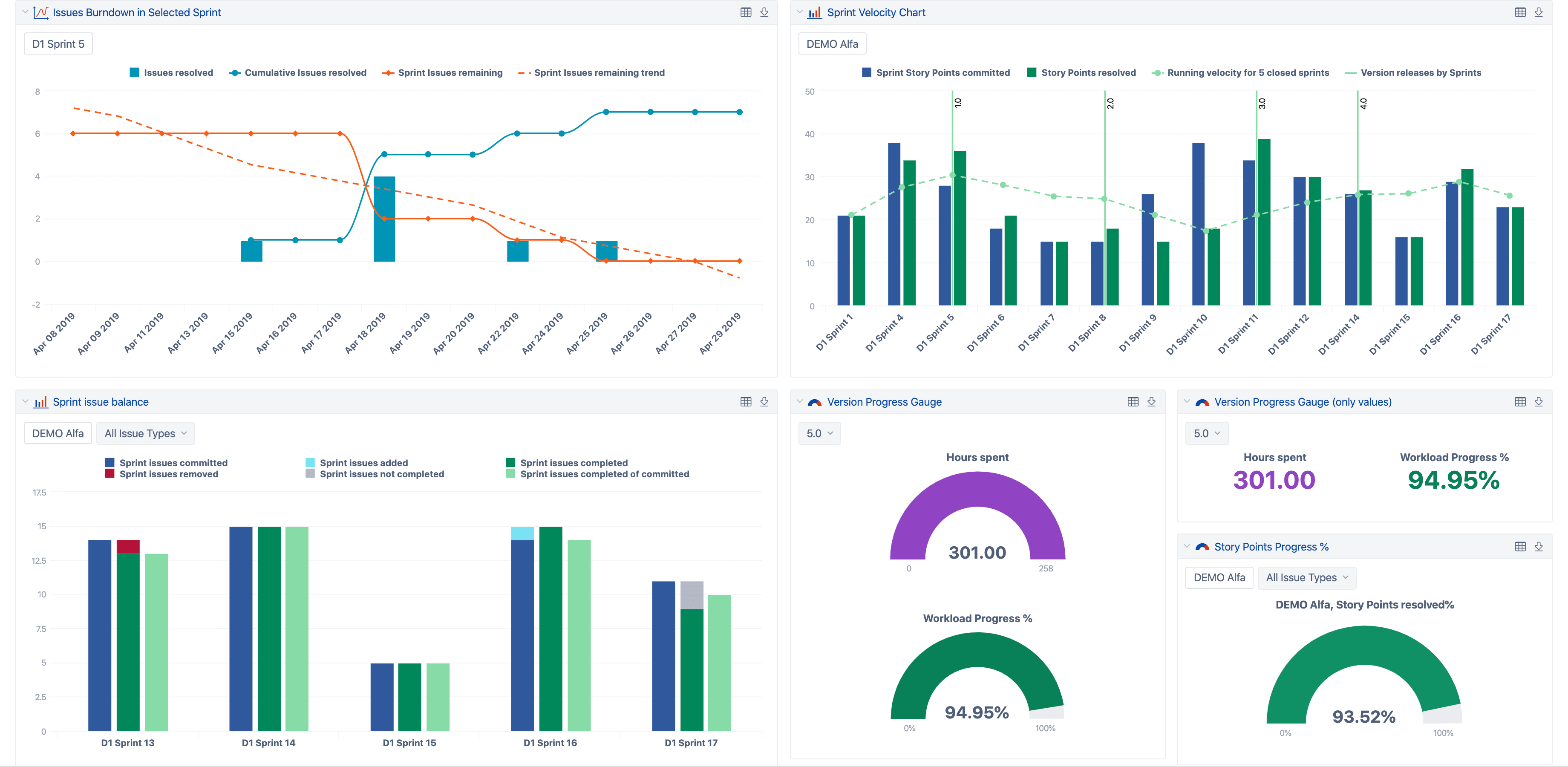 Consistent colors for your sprint reports, burn-up and burn-down charts, versions, and releases.
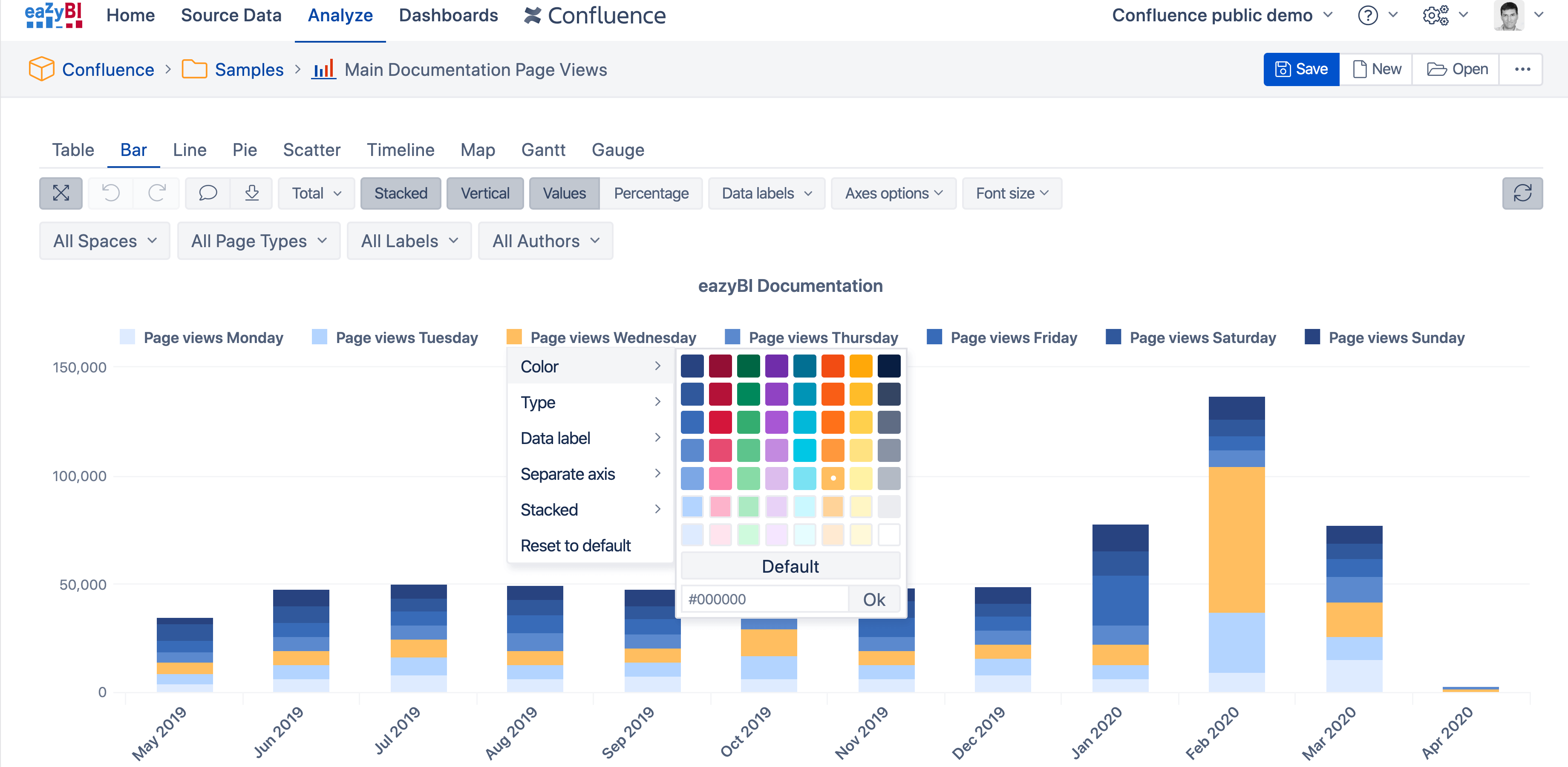 The new color selector and tones let you build beautiful charts.
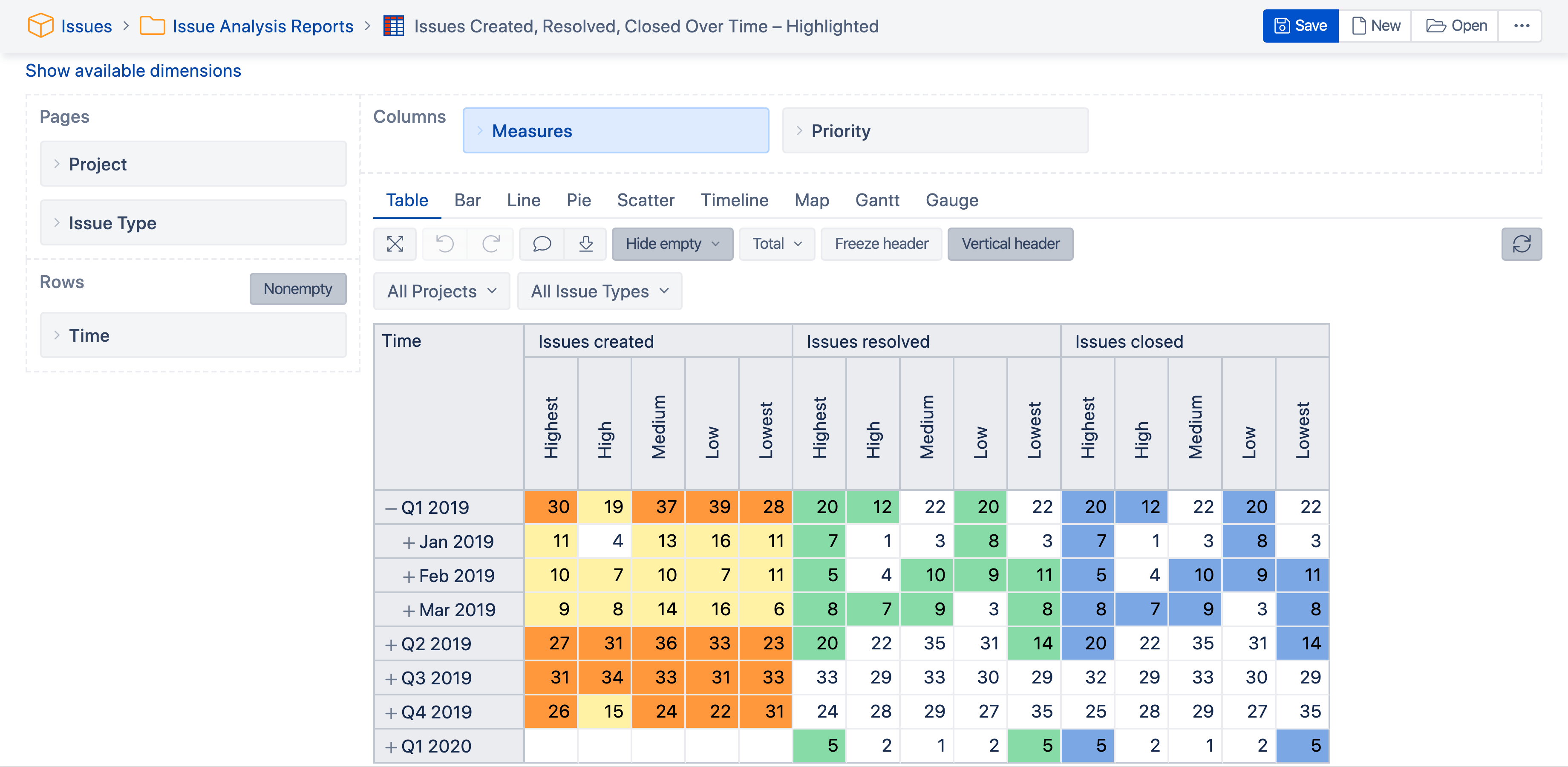 Lighter-gray table design with cell-highlighting (with more advanced highlighting options coming soon).
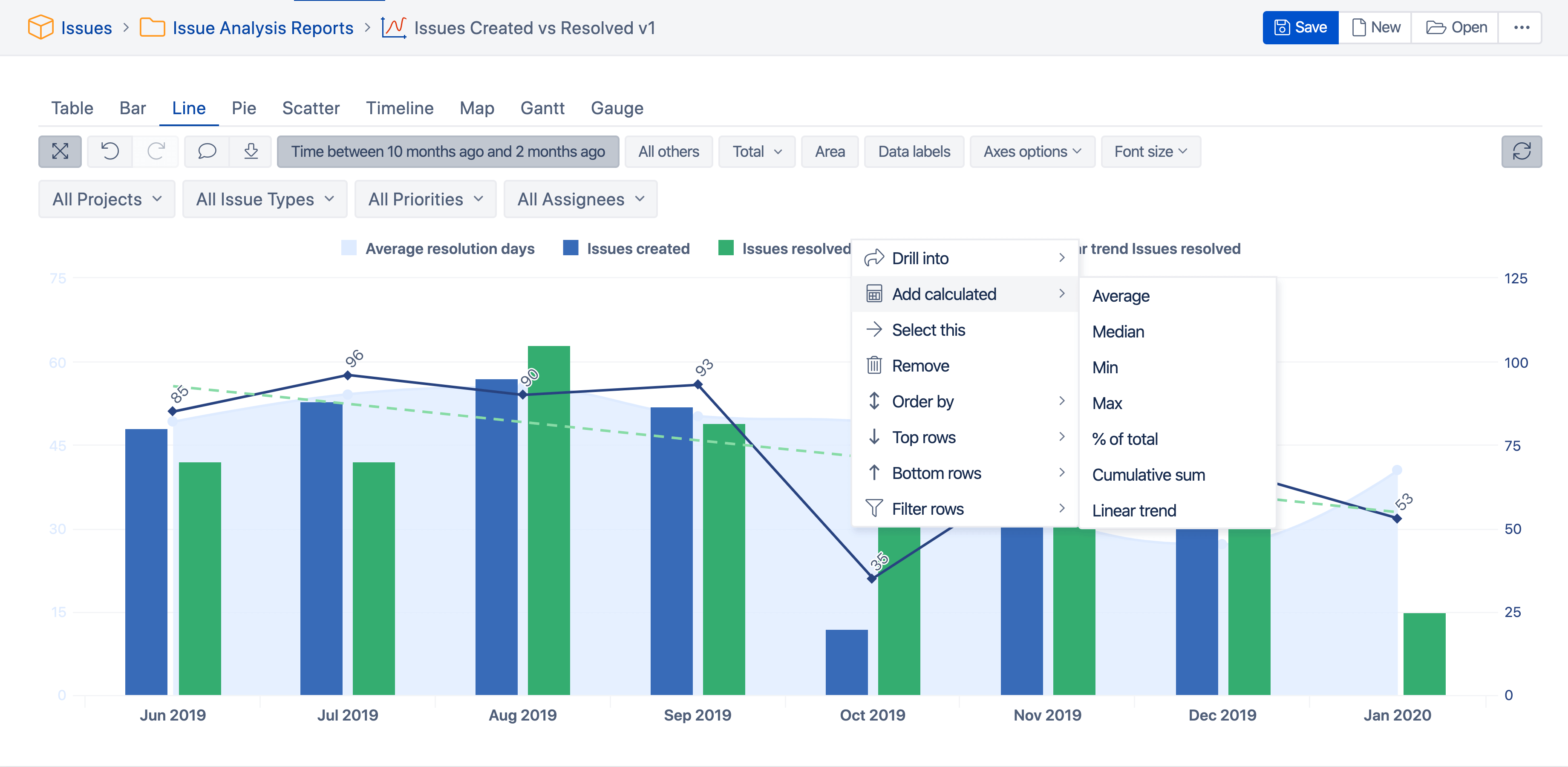 Add useful calculations with the new ”Add calculated“ option.
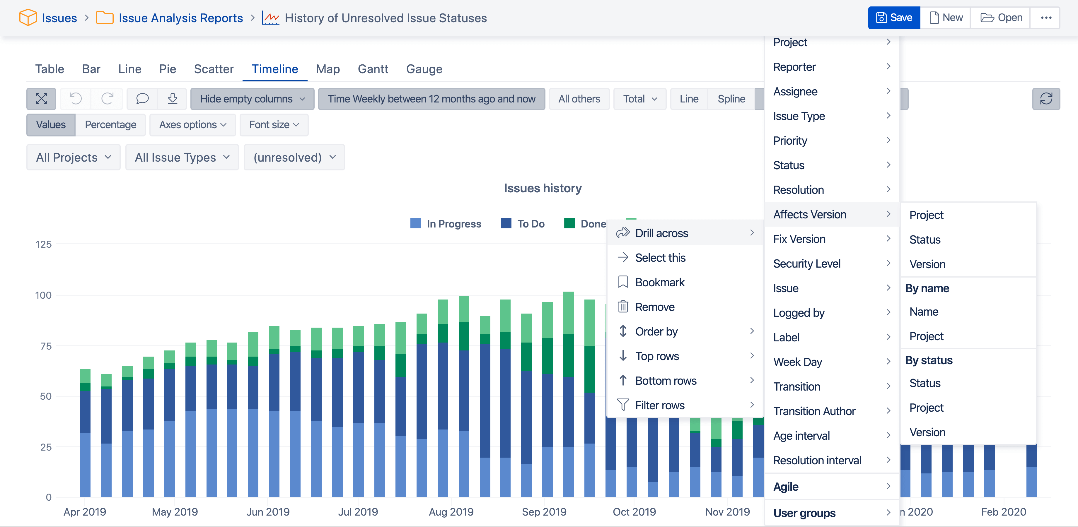 Explore your data — drill into details or across dimensions.
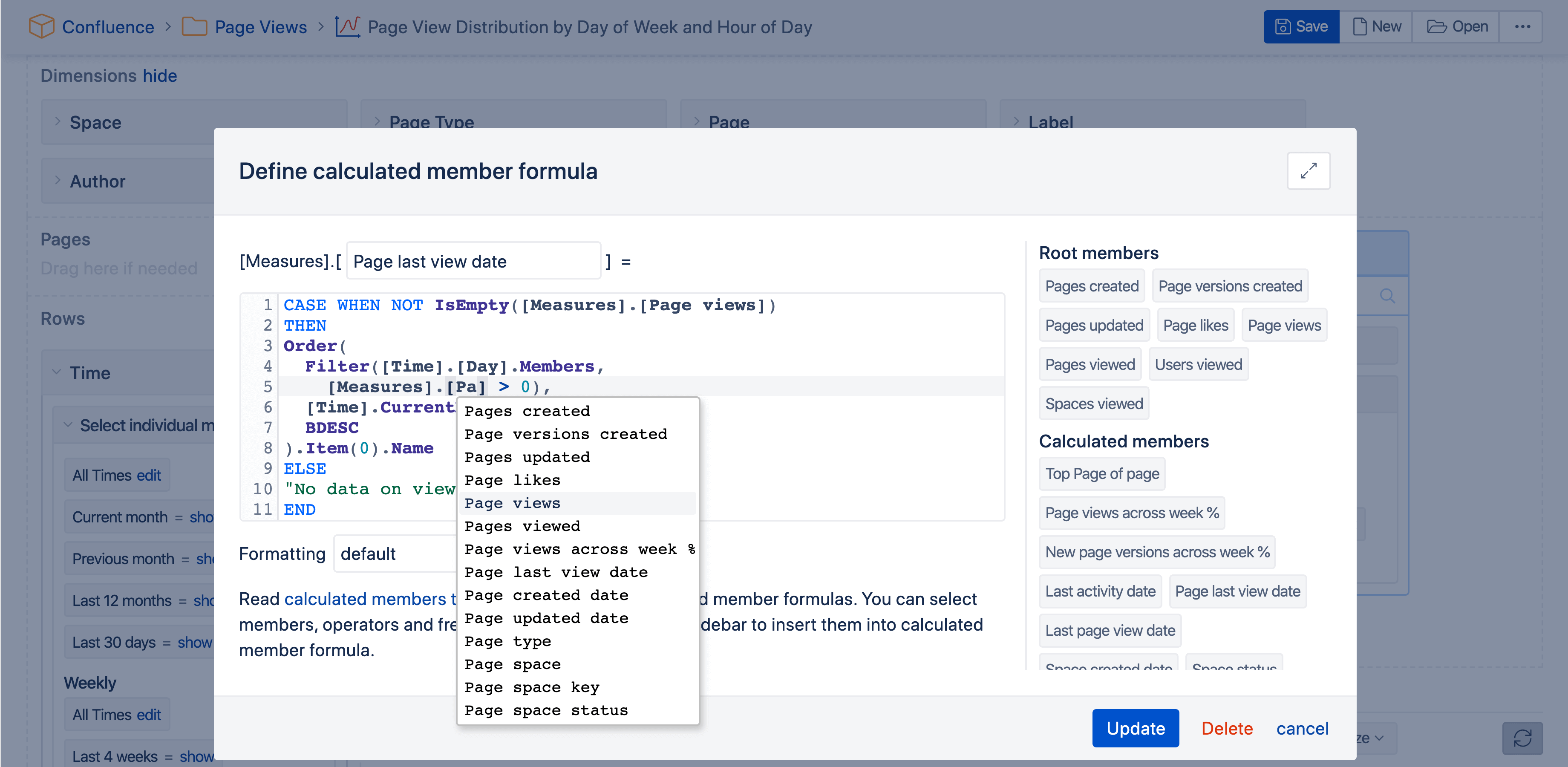 More consistent color-coding for the MDX editor’s syntax highlighter.
Just when we think we have covered all the bases, there’s always just one..more..thing.
~ Steve Krug
This is not the end of the journey. Let us know what you like or dislike, what annoys or helps you the most, and let us make eazyBI the best reporting tool for you.