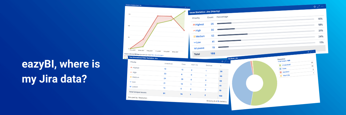

eazyBI, where is my Jira data?
Sometimes new eazyBI users get confused about how Jira data are represented in eazyBI. While Jira users are being intimately familiar with the Jira issue layout, dashboard gadgets, and issue navigator, the re-structured analytical data set in eazyBI seems different. How to make sense of it?
Hi, my name is Gerda. I’m a former Jira admin who joined eazyBI about a year ago. Despite my experience with Jira, starting out with eazyBI was not as easy as expected.
eazyBI is a business intelligence (BI) tool thus it has a glory of a fully-featured BI tool, as well as some inherited complexity. Like many other human beings, changes and the “unknown" scares me. But let me show you how eazyBI reporting works from the perspective of a Jira user and admin.
I’ll demonstrate how the Jira data in eazyBI can be represented in the same way as in Jira. And then I’ll add a few eazyBI tips to go way beyond what’s possible with Jira. This has helped me to get started, explore, and to know eazyBI better from a Jira admins perspective which was very familiar to me.
If you’re more of a video person feel free to watch the recording of my presentation from eazyBI Community Days 2020 where I explained this topic in more details.
Let’s start by taking a look at a few most popular Jira report gadgets.
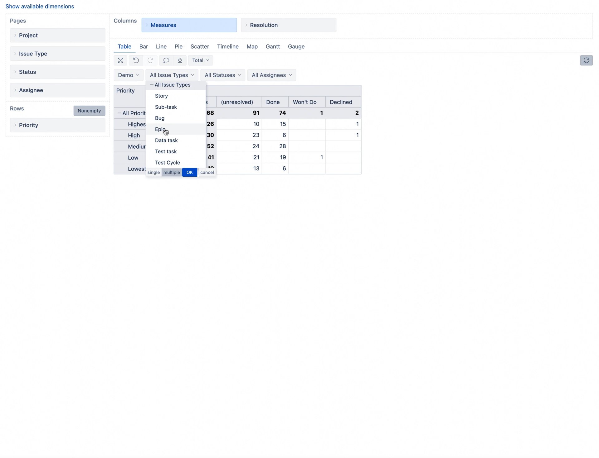
Two-Dimensional Gadget (Pivot Table)
I’ll begin with my favorite – a two-dimensional gadget. It lets you configure two fields and get a pivot table. In Jira, you can select custom or standard fields that have predefined values. In a similar way, you can look at eazyBI dimensions and members it contains, like “Resolution", “Priority", “Assignee", “Reporter", and others.
It is my favorite gadget because it gives Jira users a deeper overview of issue data. For example, how many unresolved issues are with the highest priority?
To achieve the same view in eazyBI, you can start your report creation by dragging and dropping the “Priority” dimension into columns and the “Resolution” dimension to rows. Then select in both dimensions their members and enable “Totals” for rows and columns.
We have created the same report, but eazyBI can do much more than what’s already available in Jira. Let me share a couple of ideas on how to enhance your reports with eazyBI:
- Instead of using the “Total” column, you can expand the “All Priorities” level in the dimension as it will give the same result. All level member aggregates the values beneath.
- Use cell formatting to change the background for all level members. Or use it to set some threshold for a measure that can be seen immediately.
- You can also add other dimensions in Pages for filtering. In Jira, I always needed to have one saved filter that contains data for gadgets. But in eazyBI I can have the search above the chart and change the data I want to explore.
- The “Issues created” measure is selected by default. But you can change it to any other measure. In the below example, I selected “Hours spent”. Now you can see that a lot of time has been spent on “Low” priority issues in this example.
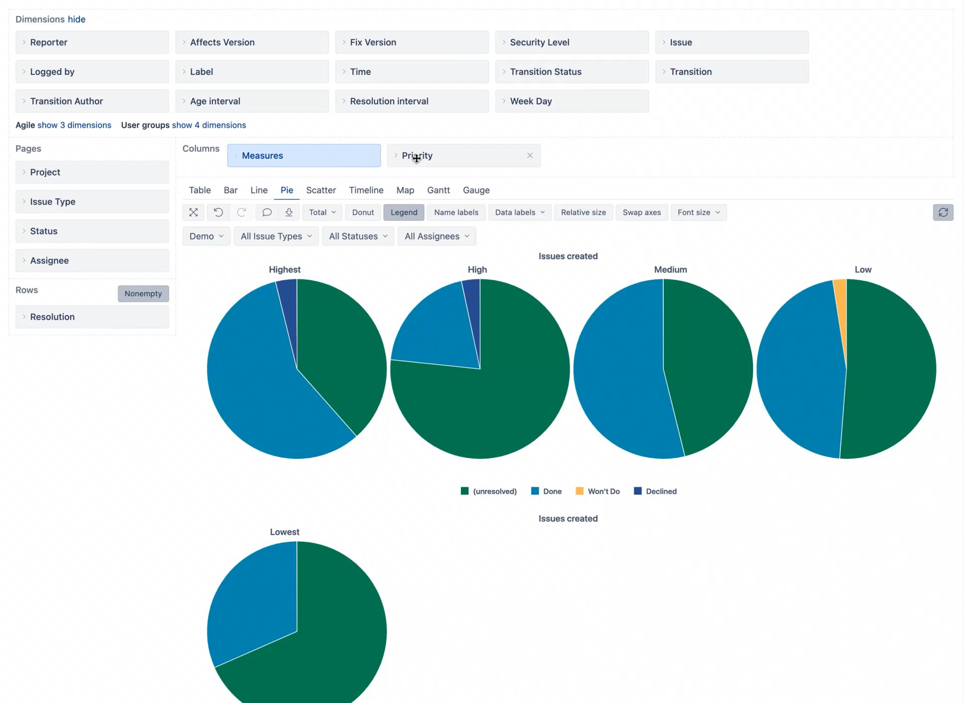
Pie Chart
I cannot imagine my dashboard without this donut chart. Though it is not recommended to use a pie or a donut chart for comparison, I do like the overview it provides in this case.
In Jira, I can get a donut chart on issue count per resolution value. In eazyBI, choosing a pie chart and selecting the donut chart option will create the same view as the Jira report.
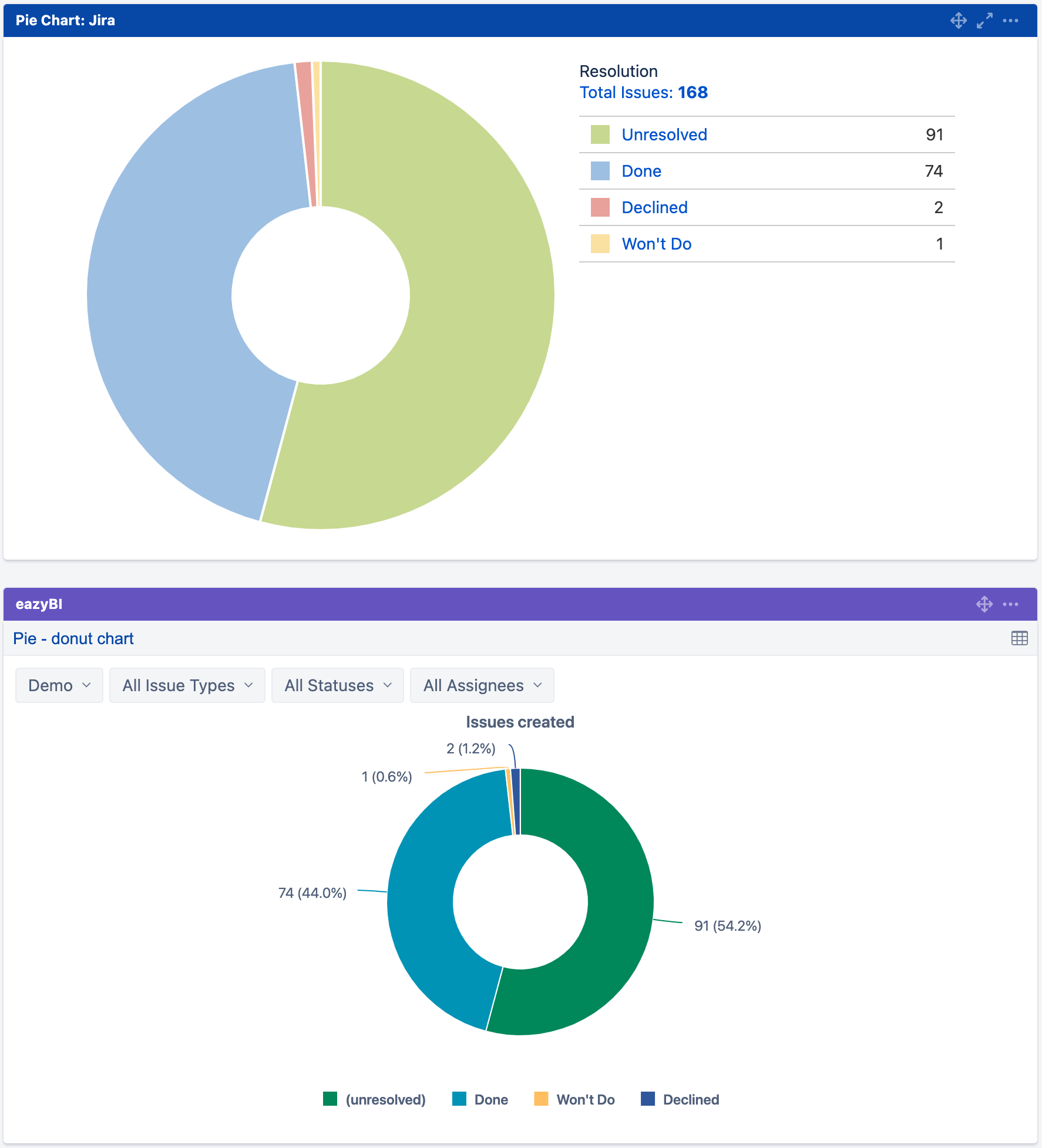
But there is much more to explore than that:
- Switch to a simple pie chart and add an additional dimension, for example – “Priority”. Now, the same information will be split by priorities – each pie for a different priority type (or any other dimension you want to split by - “Assignee”, “Reporter”, “Issue type”, etc.).
- Change the color for your dimension members to have some color coding. I recommend using the same color for dimension members (like “Unresolved”, “Done”, “Won’t do”, “Declined”) across all your reports and dashboards.
- Select a relative size option and have a quick overview of the priority type that has the most issues.
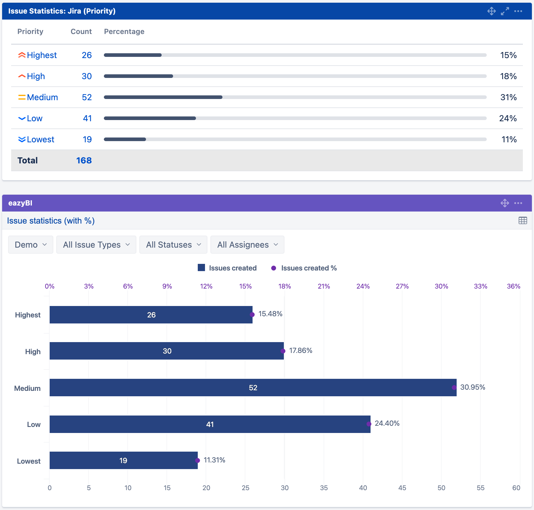
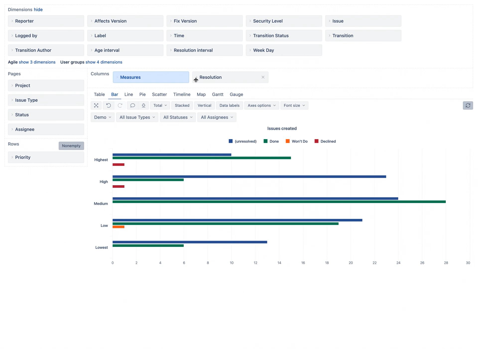
Issue Statistics
“Issue statistics” gadget in this example shows the issue count per priority type. In eazyBI, choosing the bar chart, and adding % from the total, gives the same look as in Jira.
eazyBI allows you to have a more granular view:
- Add one more dimension to see the data split by resolution (or any other dimension you want to see – “Assignee”, “Reporter”, “Issue type”, etc.)
- Select the stacked option to see the dimension members next to each other.
- Select the percentage option to see each proportion value as a percentage of the total. Also, enable data labels to see the percentage values.
Created vs Resolved Issues
“Created vs resolved chart” in Jira shows how many issues have been created and resolved over a period of time. You can get the same view in eazyBI by selecting “Issues created” and “Issues resolved” measures and using a line chart area option for data visualization.
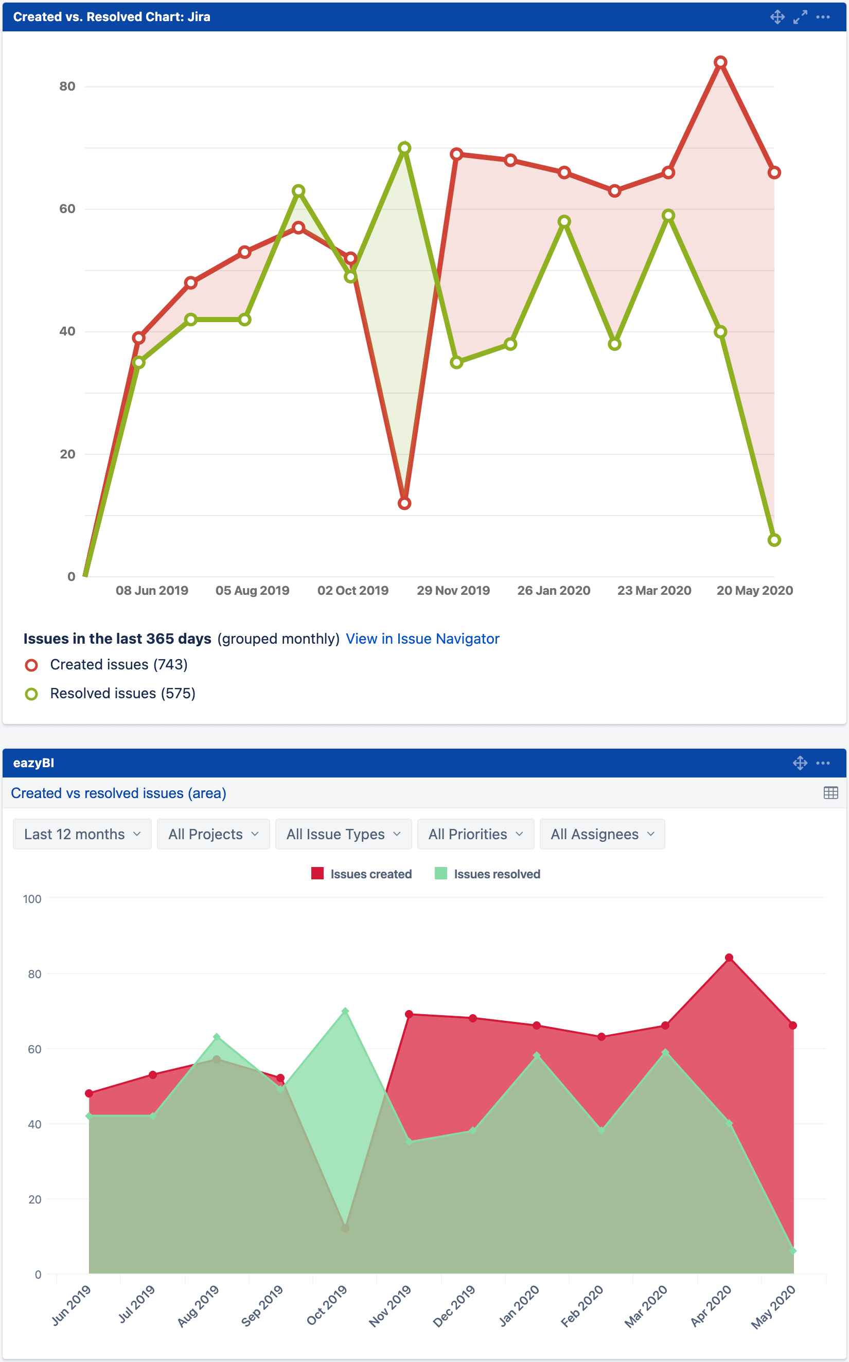
In eazyBI, you can add more data and enhance your reports:
- Add more measures to see Jira data from different perspectives.
- Mix chart types so each measure can be distinguished in the report.
- Use different axis if the measures are represented by different units.
- And explore more options in each chart…
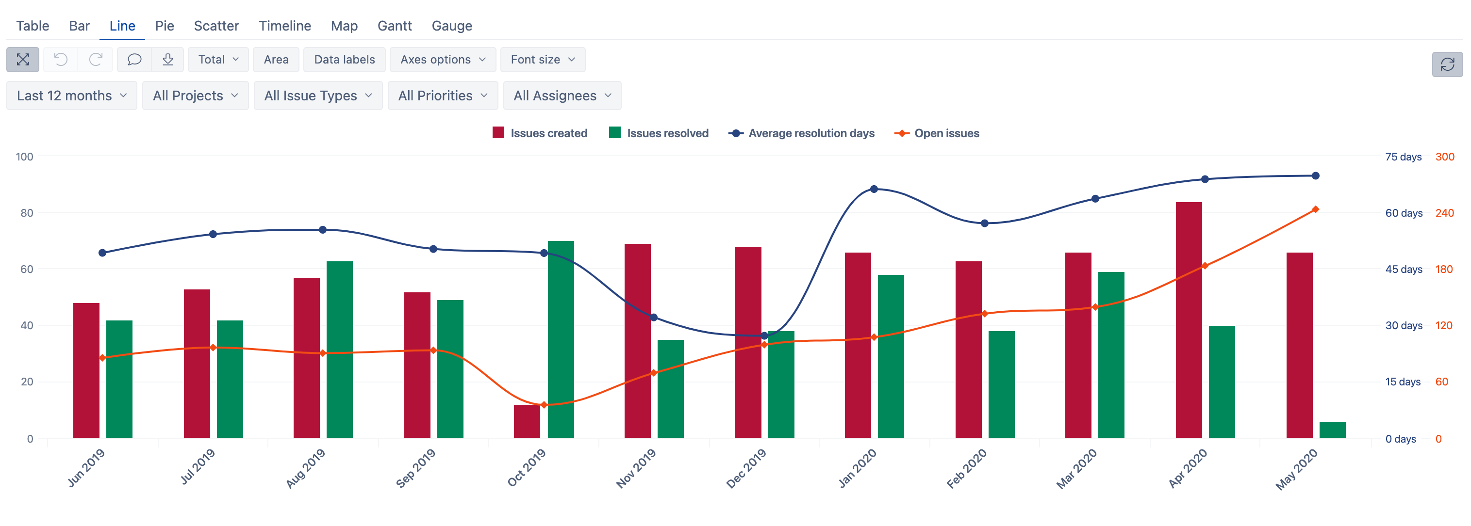
Combine all these methods to get a complete issue overview in one report.
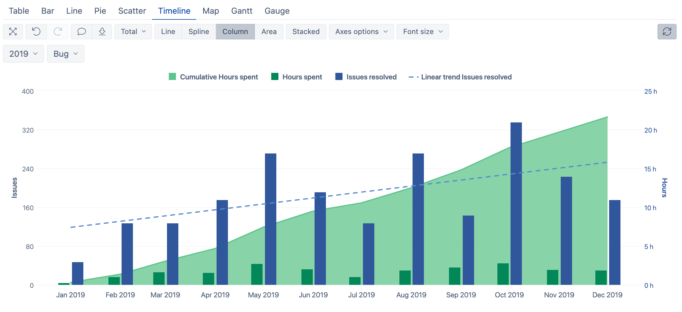
In the report below, you can see how many issues have been created and resolved in each month, and how many days on average it took for issues to be resolved. In addition, the “Open issues” measure shows unresolved issues at the end of each month. “Open issues” are calculated as all “Issues created” minus “Issues resolved” in a particular month.
(If you want to see how you can interact with the report, see it in eazyBI demo account)
Simple, Yet Advanced Tip!
Sometimes you might want to investigate and do some more complex things with your Jira data. In eazyBI, there are different advanced built-in calculations available for easy issue data analysis – min, max, average, trend-lines, comparison to previous periods, and others. You can add those to your charts with a couple of clicks. These are handy and powerful tools helping you explore your Jira data easily.
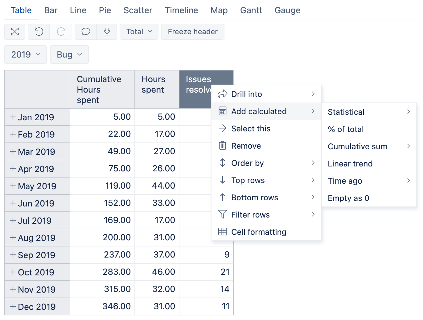
Combine these calculations with different options that I showed you in this article and achieve a nice-looking report like this (if you want to see step by step on how it is built, check eazyBI training videos: Episode 4)
My last advice to you – keep exploring Jira with eazyBI. Find reports that support your decisions and help you find hidden bottlenecks and new opportunities.
And for inspiration – see examples in eazyBI demo account, eazyBI documentation, eazyBI community, and contact eazyBI support – we’ll help you to find the answers you are looking for!